
Menu
Logo
01
Color
02
Typography
03
Putting it all together
04

Submit a Creative Request
Brand Guidelines
The FatCats brand is vibrant, bold, and charmingly imperfect. The visual design system thoughtfully combines a punchy palette, strong type, energetic photography, and organic design elements to create a carefully balanced identity optimized for our guests and community.
01
Who we are
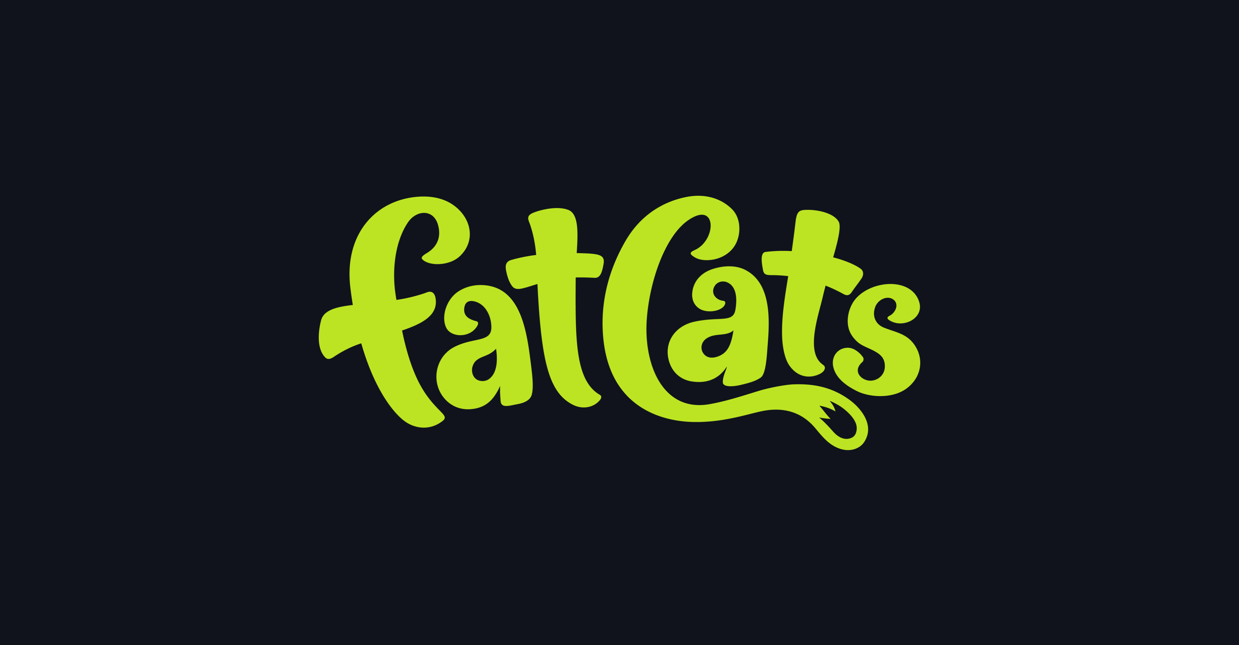
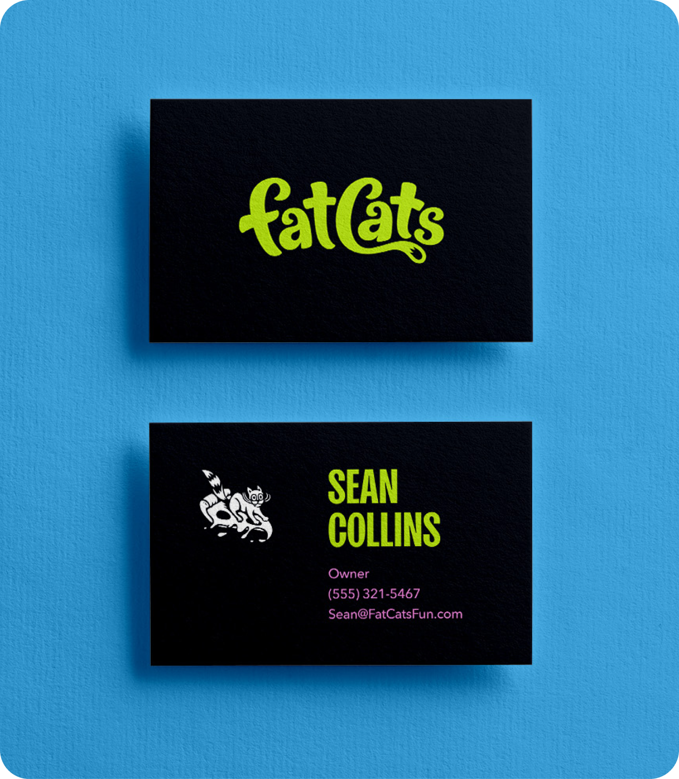
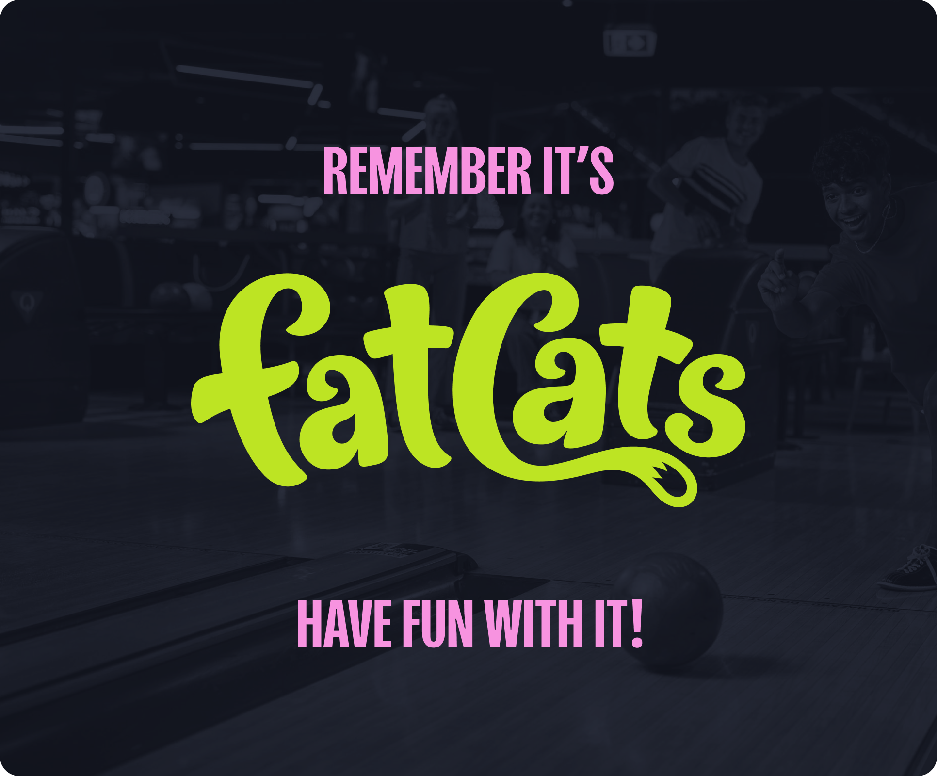
The FatCats logo has been crafted to possess an energetic, hand-drawn quality, with careful consideration to the spacing, balance, and scalability of the design. The wordmark pays homage to the old FatCats logo with a more clean, bold, and contemporary execution.
1a
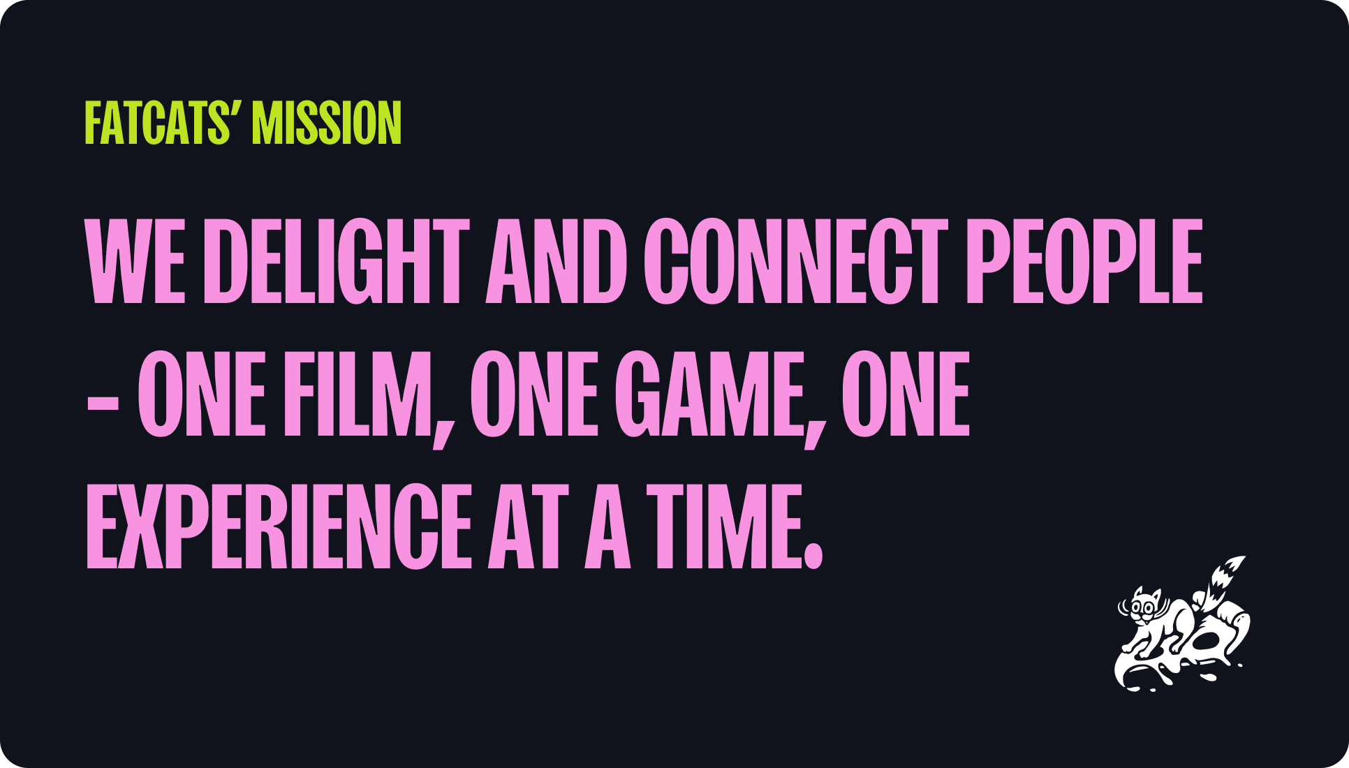
Fatcats’ mission
1B
Fatcats’ story
FatCats began in 1999 on the back of a napkin, when two friends, Dave Rutter and Sean Collins both entrepreneurs, wanted to create an environment where families could enjoy quality food, superior entertainment, and a world-class guest experience...or “All Out Fun” as they called it, all under one roof. A few simple plans with a bowling area, miniature glow golf, and a spacious arcade along with a bar-style grill were sketched out, and shortly thereafter in August 2001, the first FatCats opened just south of 3300 South in Millcreek, a suburb of Salt Lake City, UT.
FatCats in Salt Lake City was eagerly embraced by the community for its fresh take on bowling and great food where families and guests of all ages and skill levels could come and enjoy their time with one another. After seeing the community’s acceptance of the brand, Sean and Dave expanded with the opening of a location in Provo, UT in 2002. In 2007, a third FatCats in downtown Ogden, UT was added. One of their biggest expansions occurred in 2010, with the opening of two locations in the same year. One in Westminster, CO, and the other in Rexburg, ID. Rexburg was their first location that included a movie theater.
In 2015, they expanded upon the movie theater concept with a new centre in Gilbert, Arizona featuring all-reclining luxury seating along with 20 lanes of bowling, indoor glow miniature golf, and a massive arcade. The concept proved successful and since then, locations in Saratoga Springs, UT, Mesa, AZ, and Queen Creek, AZ have been added. All following the same concept but with an improved design. Currently under construction are locations in Surprise AZ, Bluffdale UT, and Clinton UT. As FatCats continues to grow, we are committed to providing all our guests with unforgettable experiences they can share with their families and friends.
1c
Brand attributes
The FatCats brand is vibrant, bold, and charmingly imperfect. The visual design system thoughtfully combines a punchy palette, strong type, energetic photography, and organic design elements to create a carefully balanced identity optimized for our guests and community. Consider these descriptive terms when producing anything for the FatCats brand. FatCats is...

02
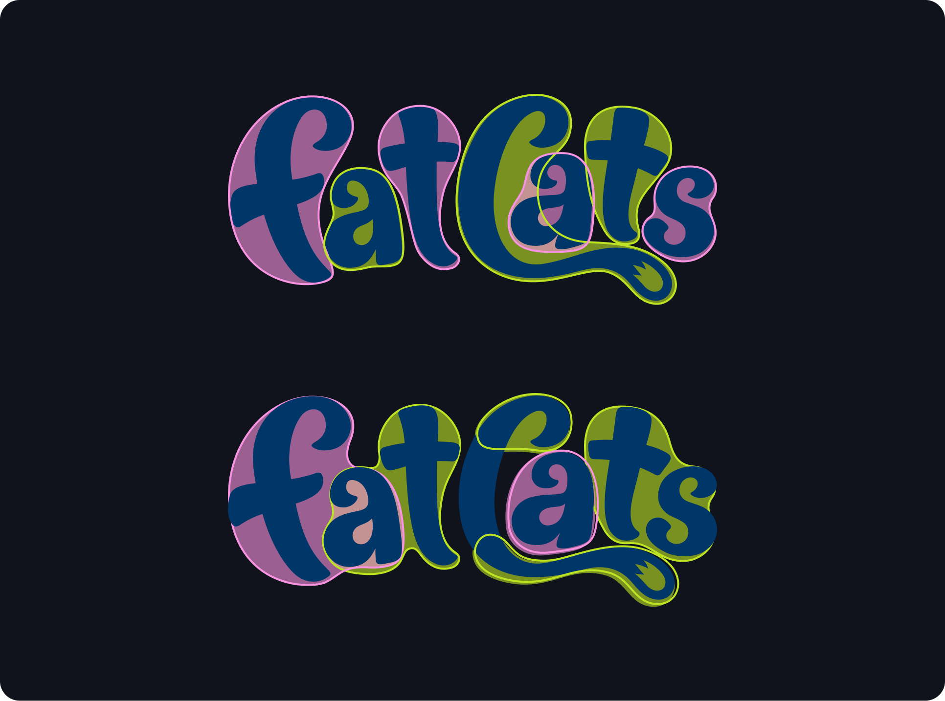
Logo
The FatCats logo has been crafted to possess an energetic, hand-drawn quality, with careful consideration to the spacing, balance, and scalability of the design. The wordmark pays homage to the old FatCats logo with a more clean, bold, and contemporary execution.
2a
Primary Logo
The FatCats logo has been crafted to possess an energetic, hand-drawn quality, with careful consideration to the spacing, balance, and scalability of the design. The wordmark pays homage to the old FatCats logo with a more clean, bold, and contemporary execution.
2B
Layout variations
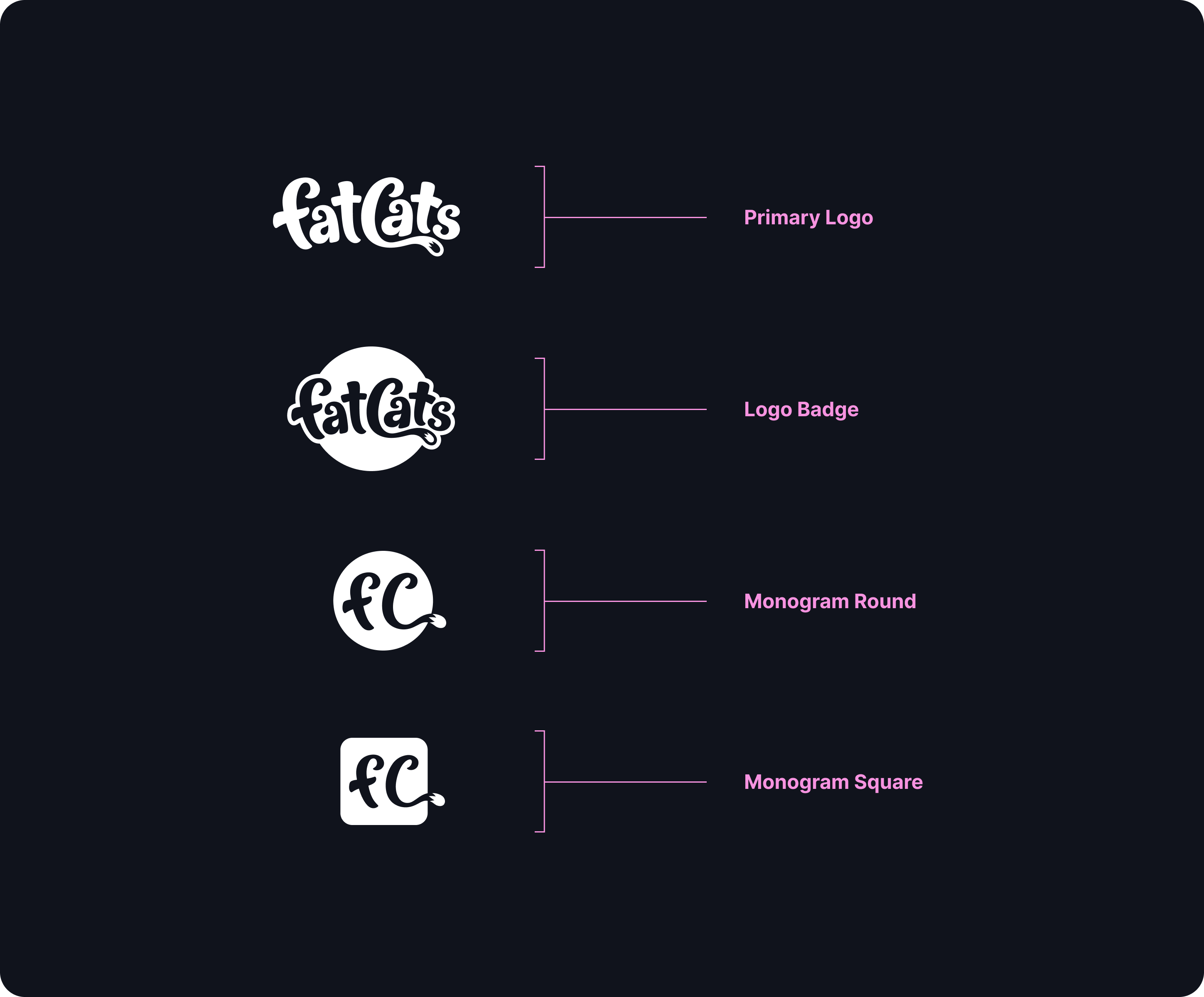
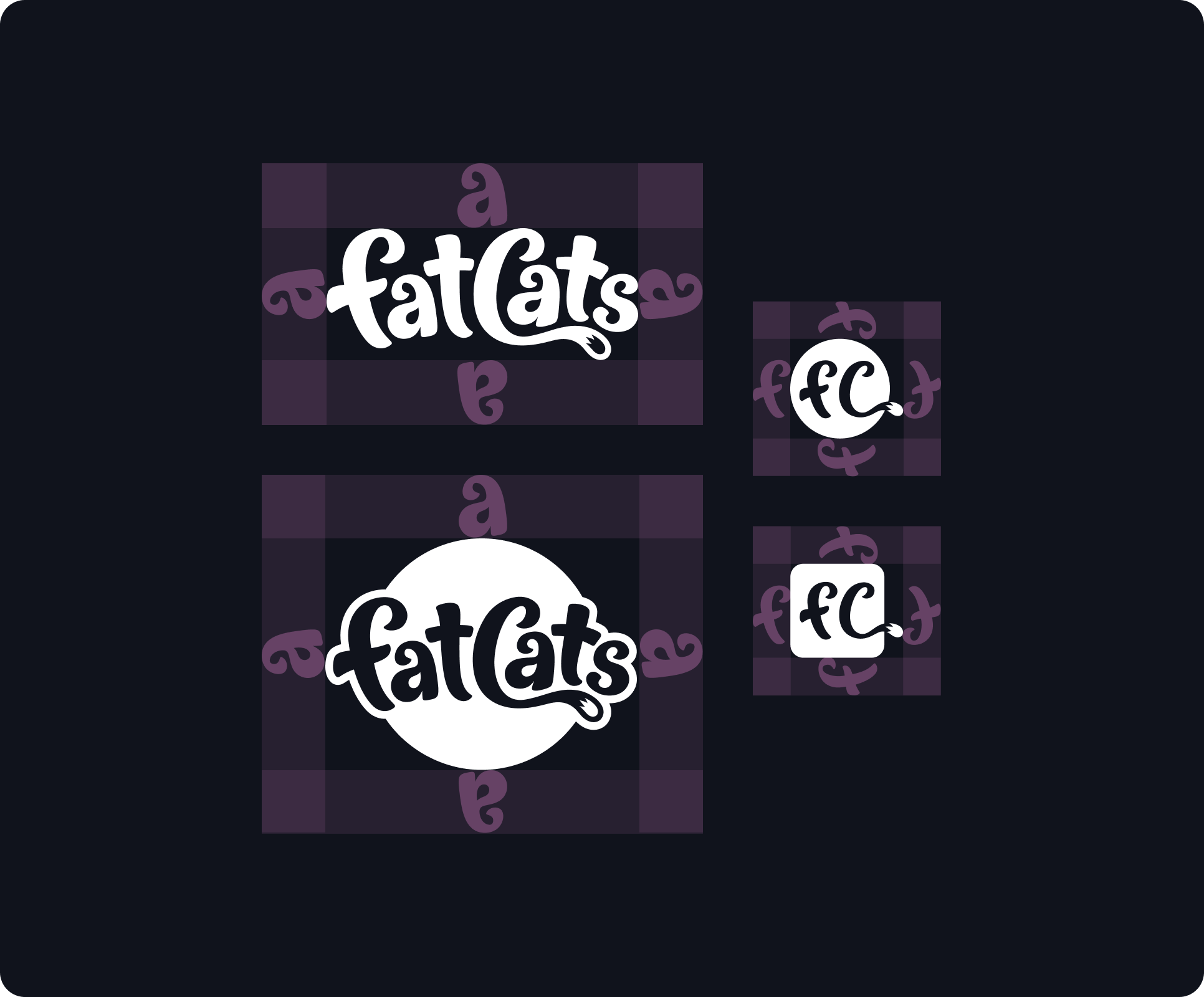
The FatCats logo system contains responsive variations of the FatCats logo. The primary logo should be the default for branded applications. The logo badge can be used to add visual weight or when reinforcing the connection between the old logo and the new. The monograms should be limited to situations where the viewer already knows the name of the company or they can see it elsewhere in the designed space.
2c
Recommended Color
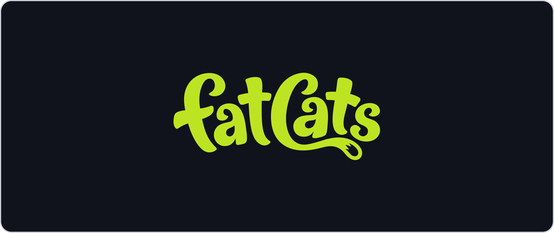
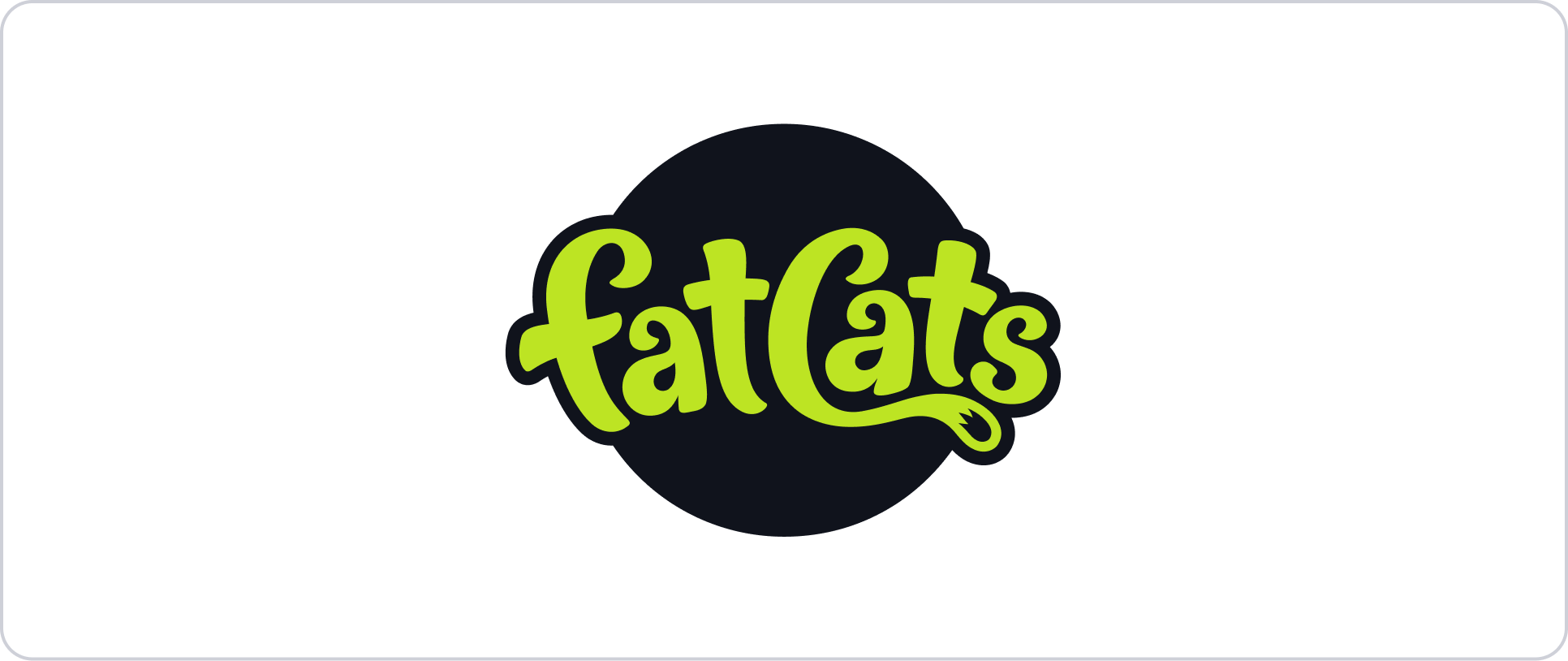
While the FatCats brand is colorful and varied, we recommend using Lime Green for the logo when possible. This helps to reinforce the connection between the logo and the main brand color.
Lime Green does not have good contrast over white, so for applications on a white or light surface you can use the badge to incorporate the main brand color.
2d
Clearspace
There should always be a generous amount of space around the FatCats’ logo to give it visual weight and room to breathe. If this space is missing, the logo will feel cramped and off brand. Be mindful of spacing and make sure there is enough room around the logo when making decisions on size and placement.
2e
Size Variations
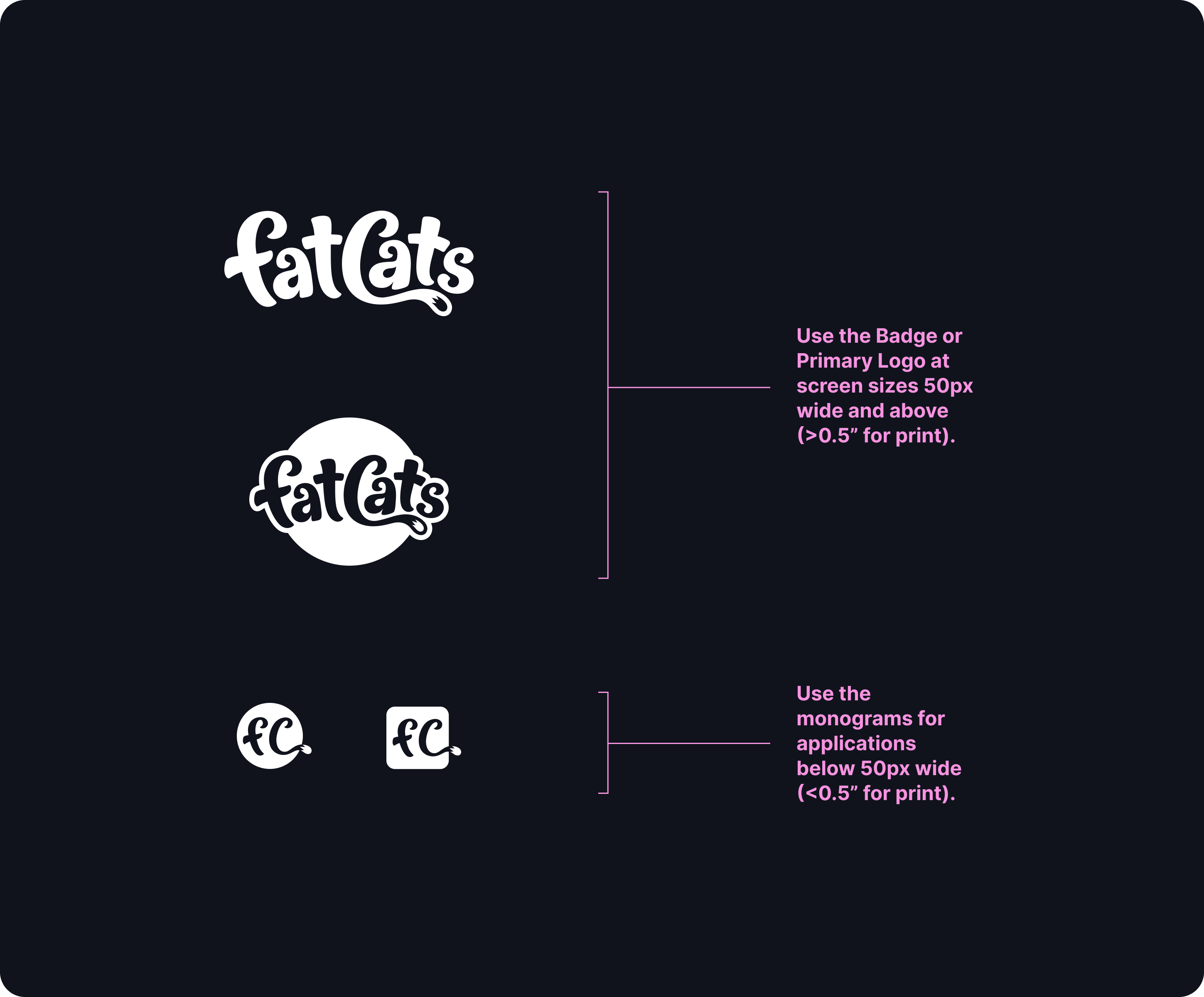
The FatCats logo was designed to be highly scalable. However, there is a limit to how small the logo can be displayed before it loses legibility. If the logo is 50px wide and above, default to the primary logo or circle badge. For use in print this translates to 0.5” and up. If the logo is presented at less than 50px wide (or less than 0.5” in print) we recommend using the round or square monogram.
2f
Color combinations
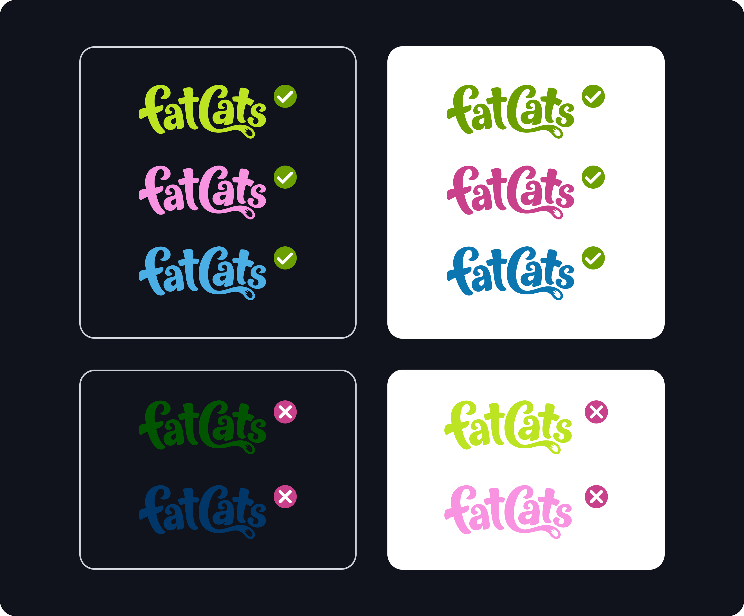
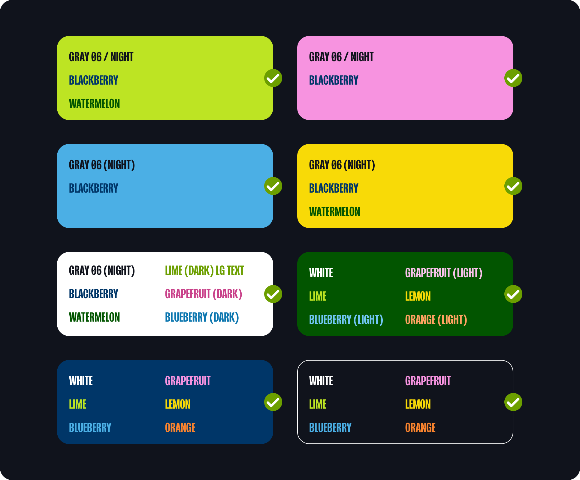
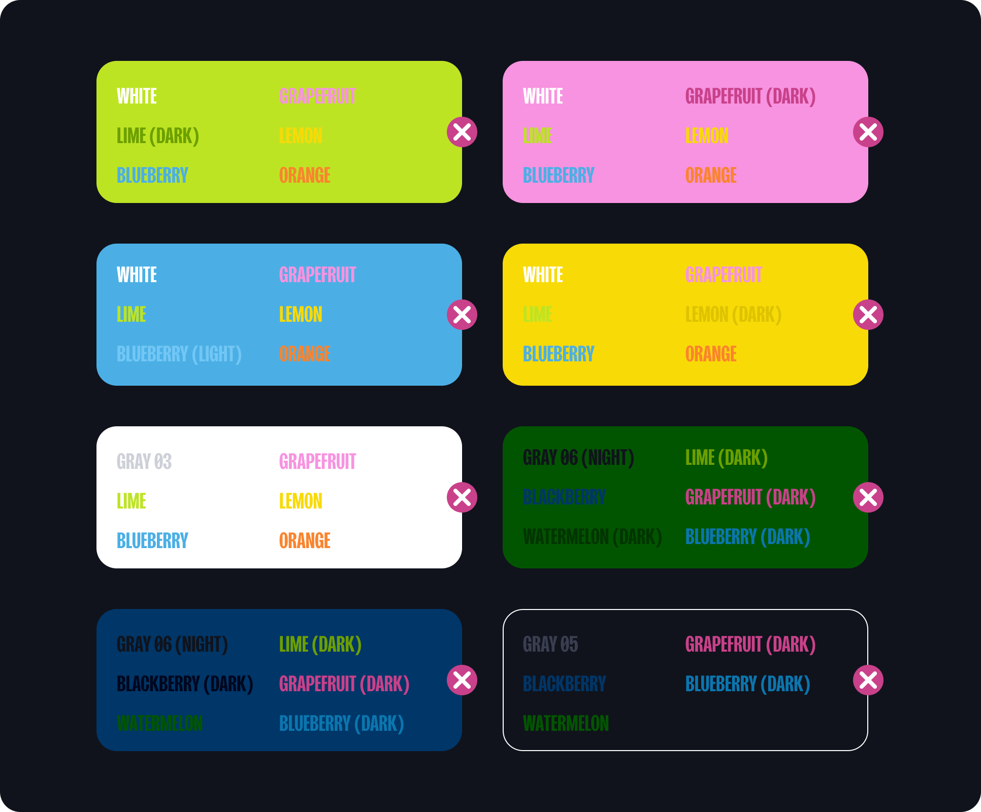
The logo should be presented in approved brand colors with high contrast against their respective backgrounds. This both reinforces the brand identify and improves visual accessibility. When placing a one color logo over a white background be sure to use the dark version of the primary colors or the logo will not have enough contrast.
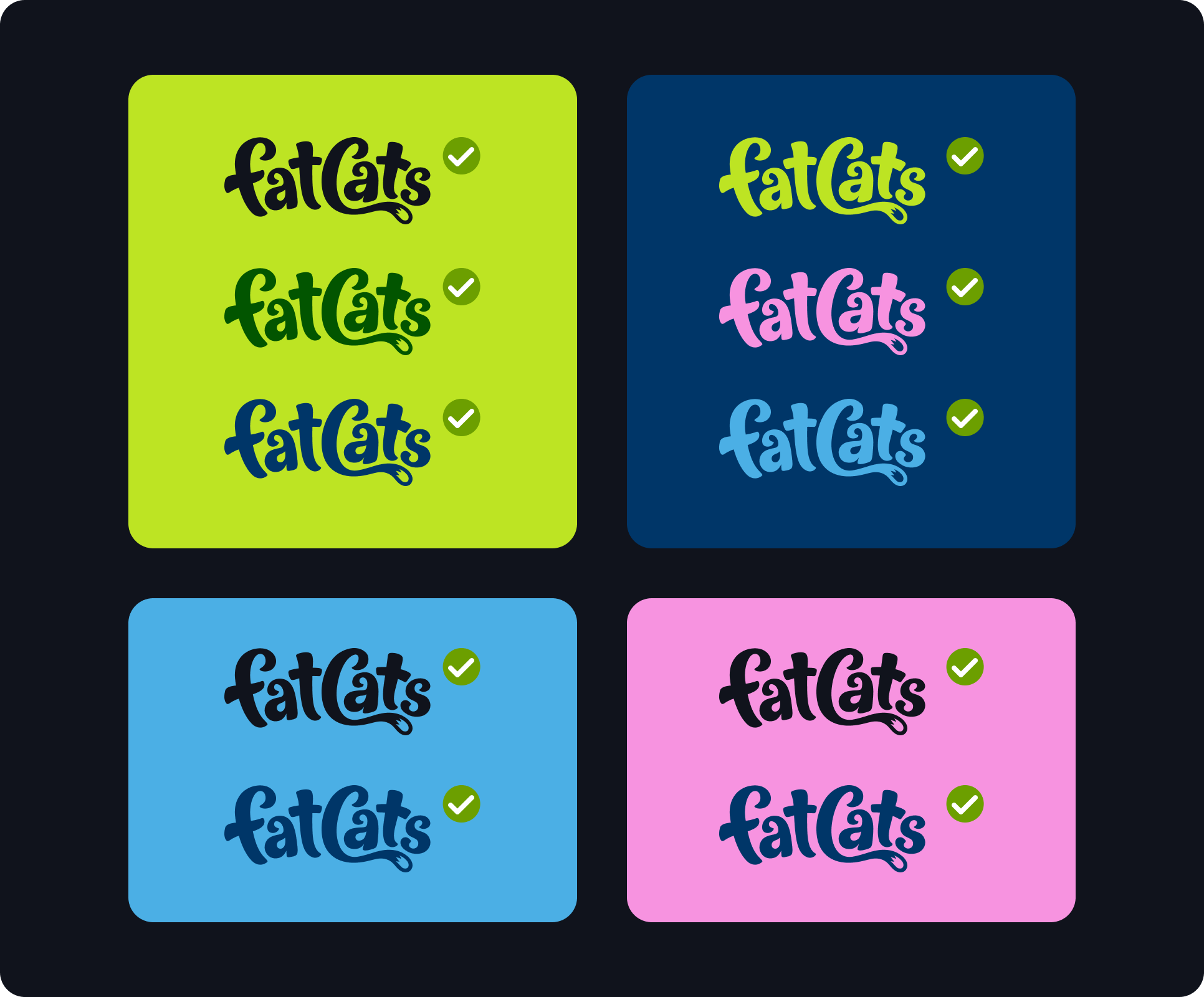
The logo should be presented in approved brand colors with high contrast against their respective backgrounds. This both builds the brand and improves accessibility. Here are some examples of color combinations that are on brand and offer good contrast. Go the the Color section of this guide to see a more comprehensive list of high contrast color combinations.
2g
two-color logo
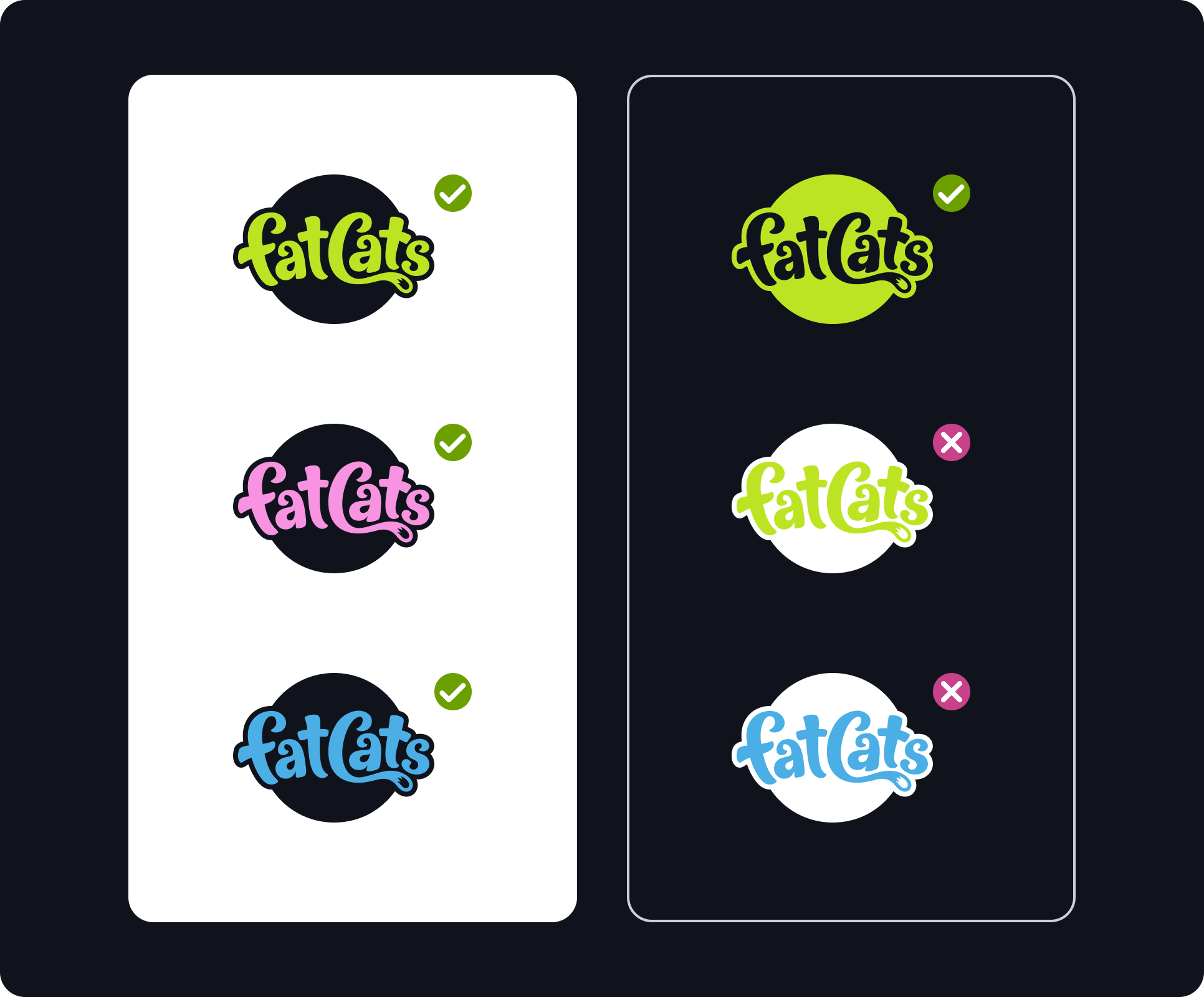
We recommend using a one color logo for most FatCats applications. However, in the interest of adding variety and flexibility to the brand we have created a two color version of the badge. This allows us to incorporate the primary colors (lime, grapefruit, & blueberry) into applications with white backgrounds while maintaining high contrast. We are not recommending using the two color badge over a dark background. The primary brand colors offer great contrast over dark backgrounds so a single color logo works best.
2h
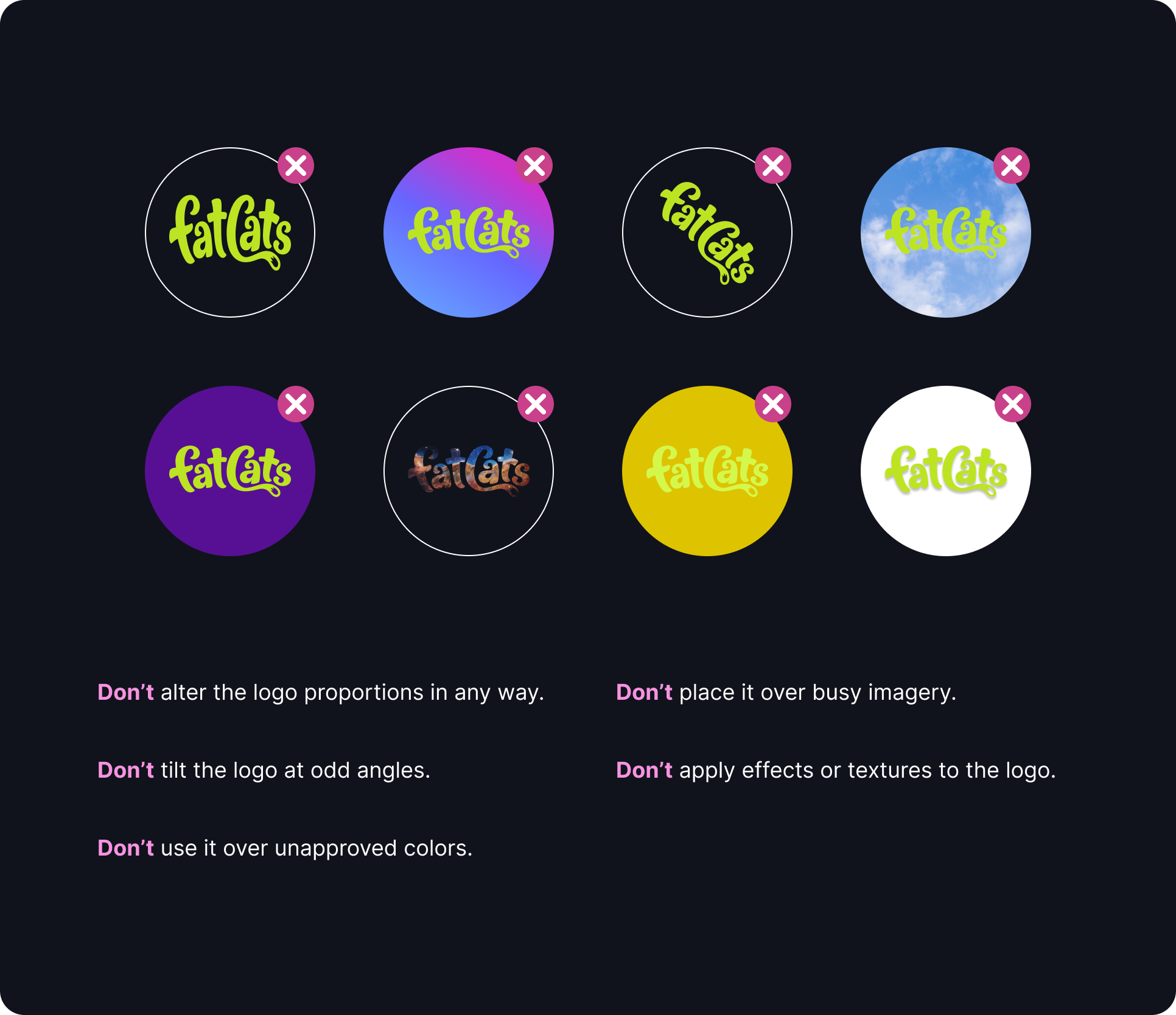
Incorrect Usage
2i
Partnerships
03
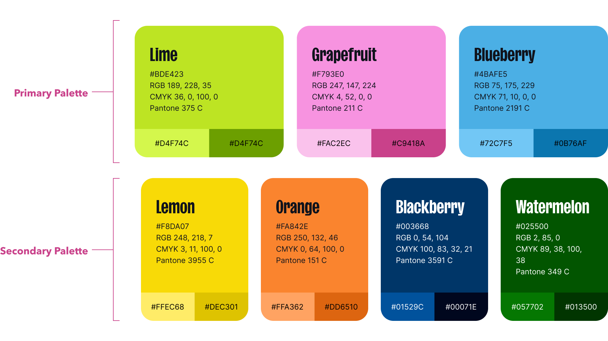
Color
The colors used for FatCats reflect the brand attributes. They are vibrant, playful, and versatile. The colors were inspired by clean citrus fruits and bright neon signs.
3a
Color Palette
3b
The New Black

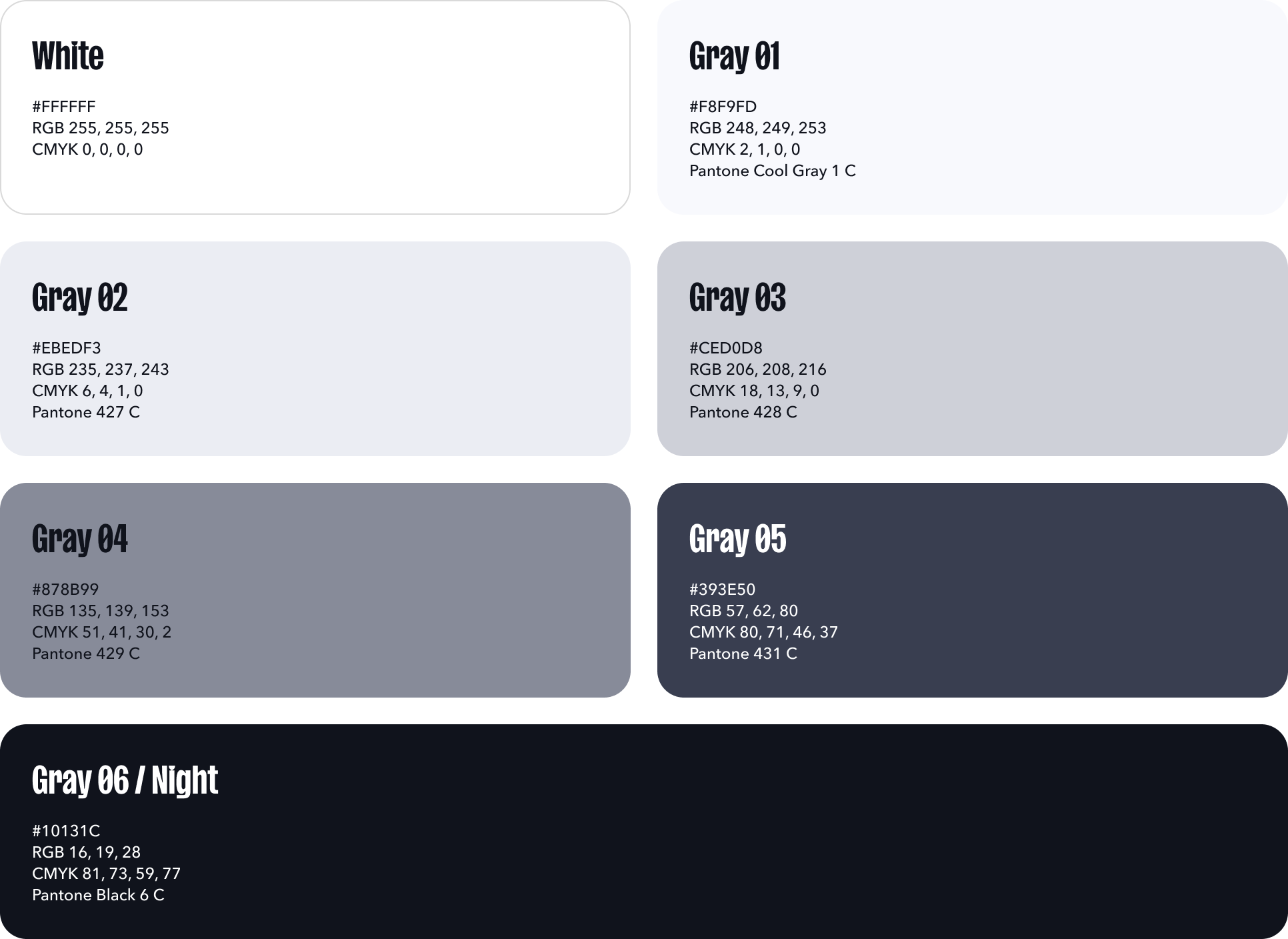
Because FatCats does not have pure black (#000000) in our color palette, anytime you would use black use Grey 06/Night (#10131C) instead. Blackberry (#003668) is a suitable substitution for black as well. This will help promote FatCats’ visual identity and help keep things consistent.
3c
Grayscale
3d
Proportions
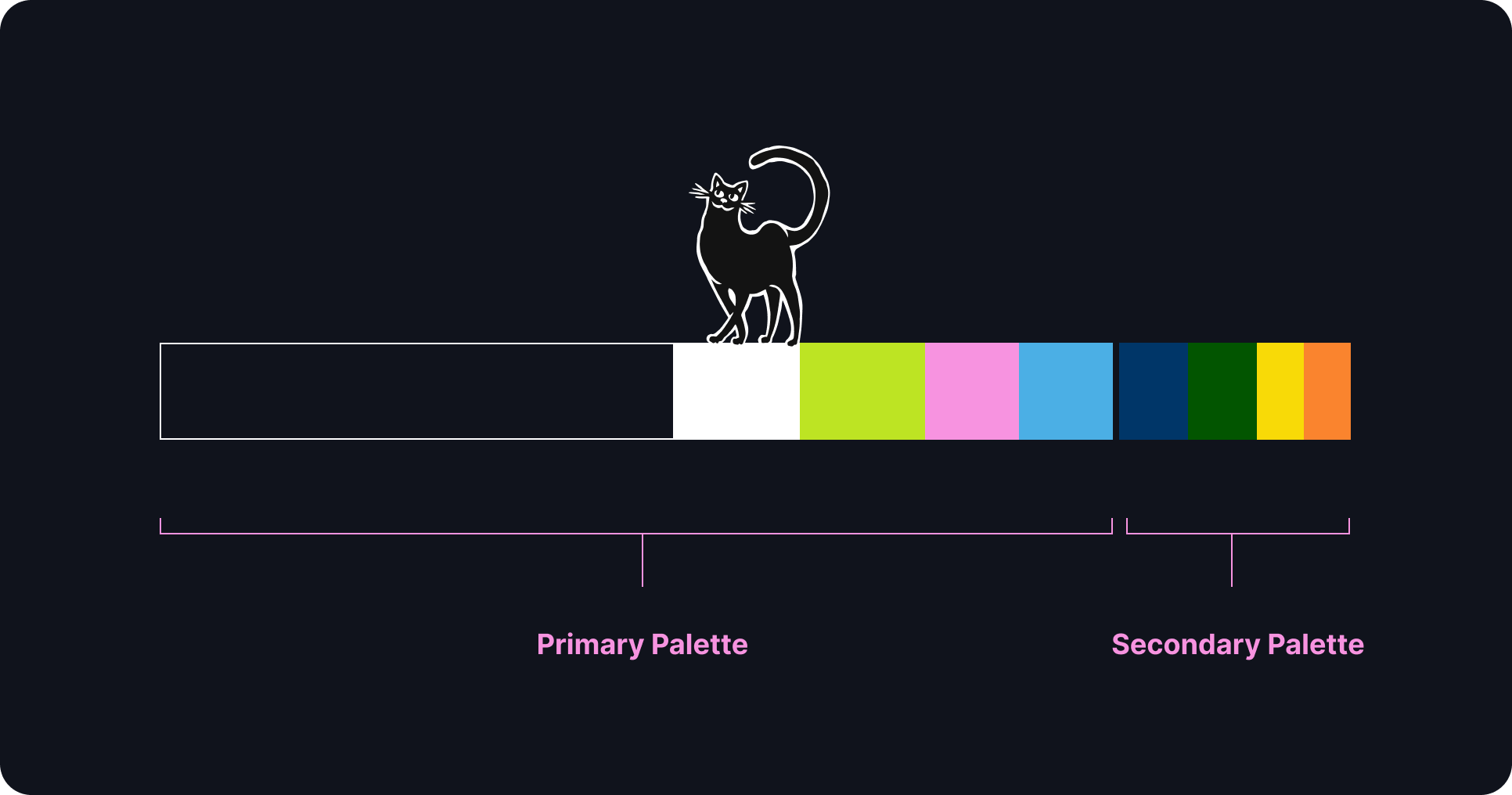
The color proportions approximate how color should be used in branded material.
Negative space is an integral part of FatCats’ brand. Including ample breathing room between elements helps designs feel professional, clear, and calm.
3e
High Contrast
Maintain high contrast with all important design elements. This is especially true for text and UI components. High contrast (AAA) as defined by the WCAG requires a contrast ratio of at least 7:1 for normal text and 4.5:1 for large text. Large text is defined as 14 point and bold or larger, or 18 point or larger.
As a general rule, use all of the bright brand colors over dark backgrounds (Night, Blackberry, or Watermelon)— or use light/bright colors as a background and place dark colors over them. Easy!
3f
Low Contrast
Avoid low contrast combinations for any important content (something the viewer needs to see).
In some instances low contrast color combinations can be used to add visual interest or texture to a design, but be mindful that this low contrast content will not be visible to everyone.
04
type and Spacing
The typefaces for FatCats are Sans Plomb and Avenir Next.
Sans Plomb is a grotesque family inspired by the automotive world of the 80’s: from gas station signs to spare part brands, the font takes us back a few decades, when typefaces were somehow imperfect — and beautiful for that. It’s the perfect family for huge display titles.
Avenir Next is a new take on a classic font—it’s the result of a project whose goal was to take a beautifully designed sans and update it so that its technical standards surpass the status quo, leaving us with a truly superior sans family.


4a
Typescale
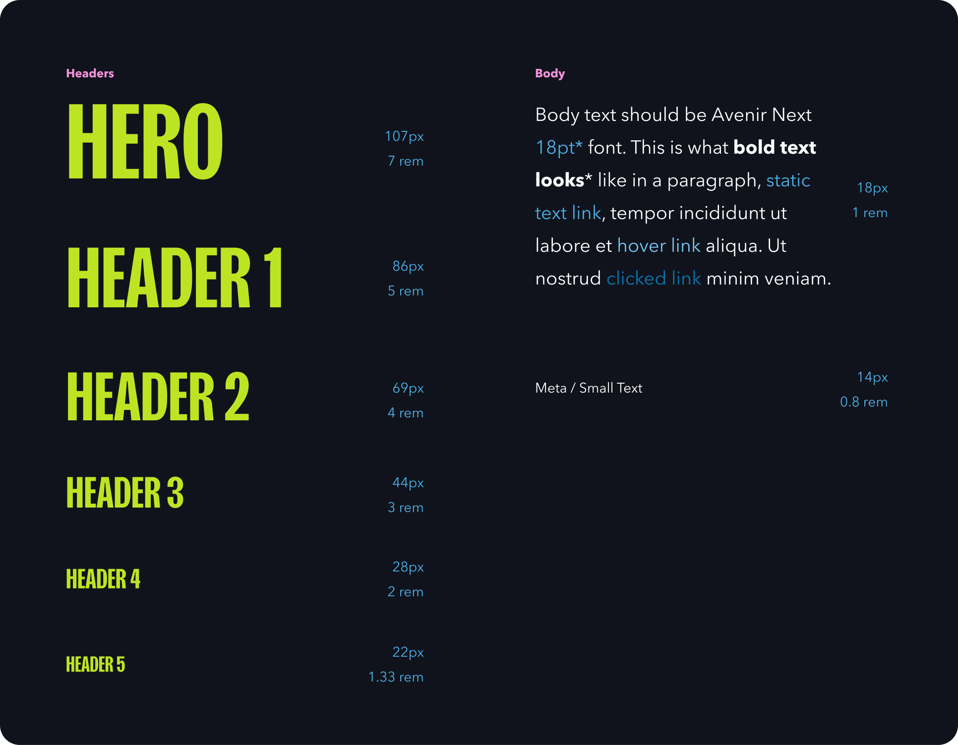
The FatCats type scale is different size of type that may be used for anything and everything associated with the brand. Use these guidelines for sizing and spacing of type. The type is built on a 18px type base (or 1 rem). The line-height (space between lines of text) is 1x (or 100%) for Sans Plomb headers and 1.75x (or 175%) for body and meta text.
The line-height (space between lines of text) is 1x (or 100%) for Sans Plomb headers and 1.75x (or 175%) for body and meta text.
The line-height (space between lines of text) is 1x (or 100%) for Sans Plomb headers and 1.75x (or 175%) for body and meta text.
4b
rhythm
Rhythm is a visual tempo or beat and is also called movement. It is often achieved through the careful placement of repeated components which invite the viewer's eye to jump rapidly or jump smoothly from one point to another. It refers to the spacing around different blocks of text.
The closeness between lines of text helps it feel friendlier and playful. It will help readers follow smoothly and easily and if you use this everywhere you have type, it will all stay on brand.
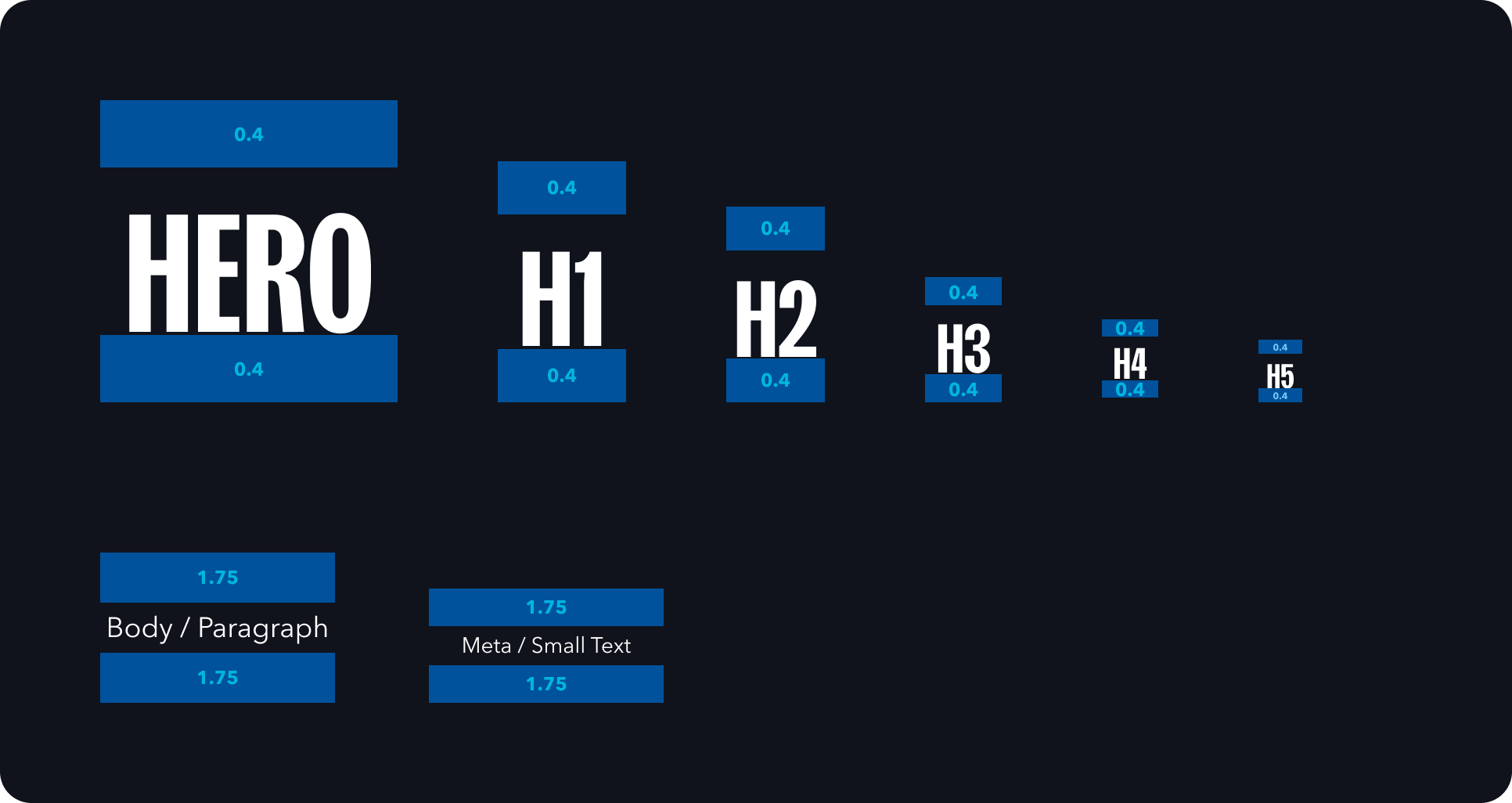
The type rhythm uses 0.4x (or 40%) for the header type sizes and 1.75x (or 175%) for body / paragraph and small text.
4c
Type Spacing
The spacing scale for FatCats refers to how distant elements should be from one another. This will ensure all communications remain consistent and thoughtful.
This scale was determined by using a minor third (1.2). Each size beyond the base of 18 px goes up by x1.2, rounded to the nearest whole pixel. The type scale was chosen based on this spacing scale and the specific spacing recommendations were chosen from the same scale.
You may use any of the sizes in this scale, but we recommend sticking with the five specified spacing sizes.
05
Photography guidelines
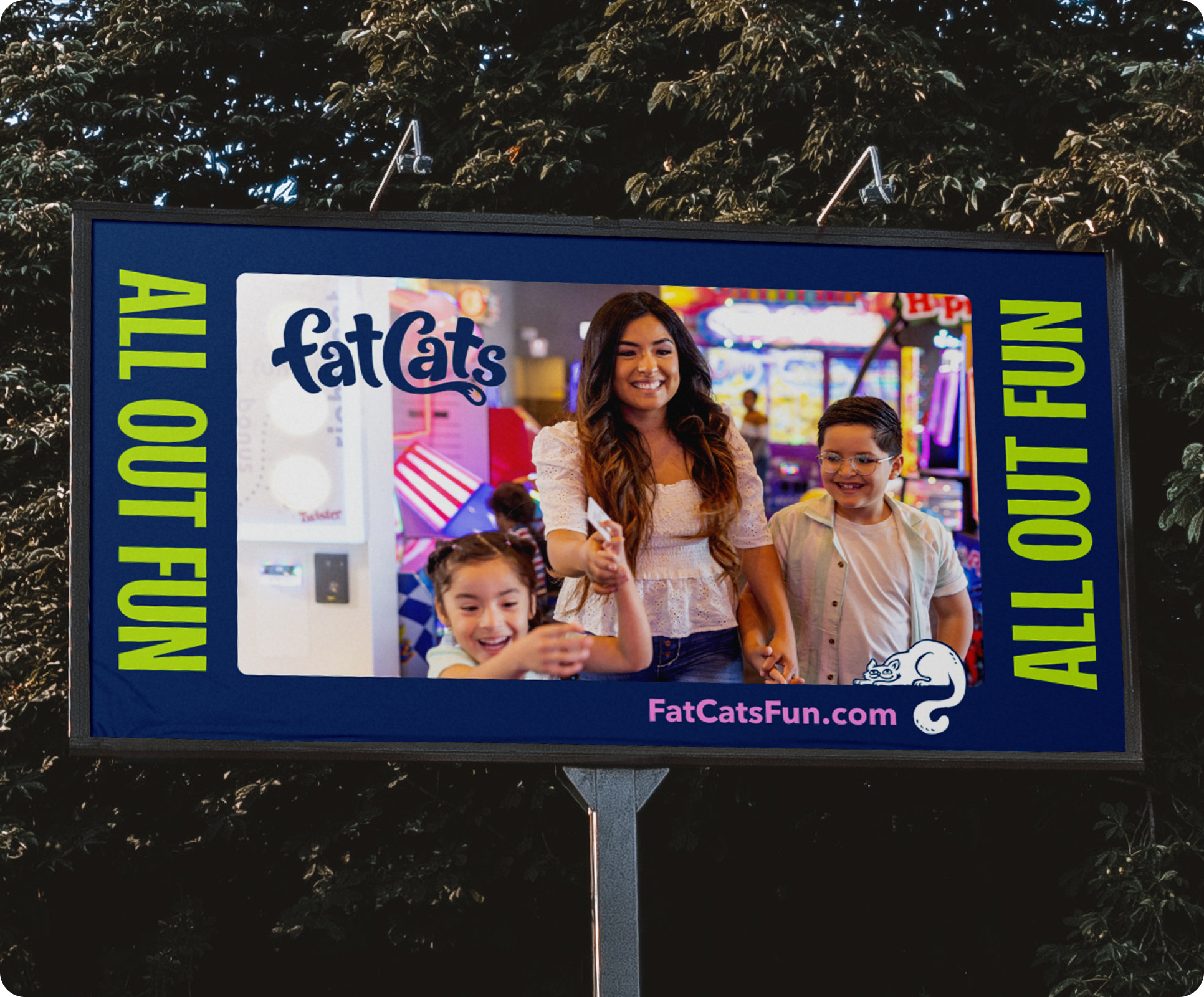
Photography is an important part of the FatCats brand. By showing diverse, relatable people having fun together we communicate our goal of delighting and connecting people. Photos should be fun, genuine, colorful, and uplifting. Whenever possible use custom photography captured in a FatCats facility.
5a
examples
5b
Things to avoid
When creating or selecting photography for FatCats consider the following:
Don’t use images that appear overly staged. This includes cheesy expressions or subjects that aren’t relatable.
Don’t use images that are chaotic or messy.
Don’t use images that showcase people worried, upset or in a negative mood.
Don’t use images with noticeable filters, moody lighting, or visual effects.
Don’t use images that aren’t family friendly.
5c
Duotone Colors
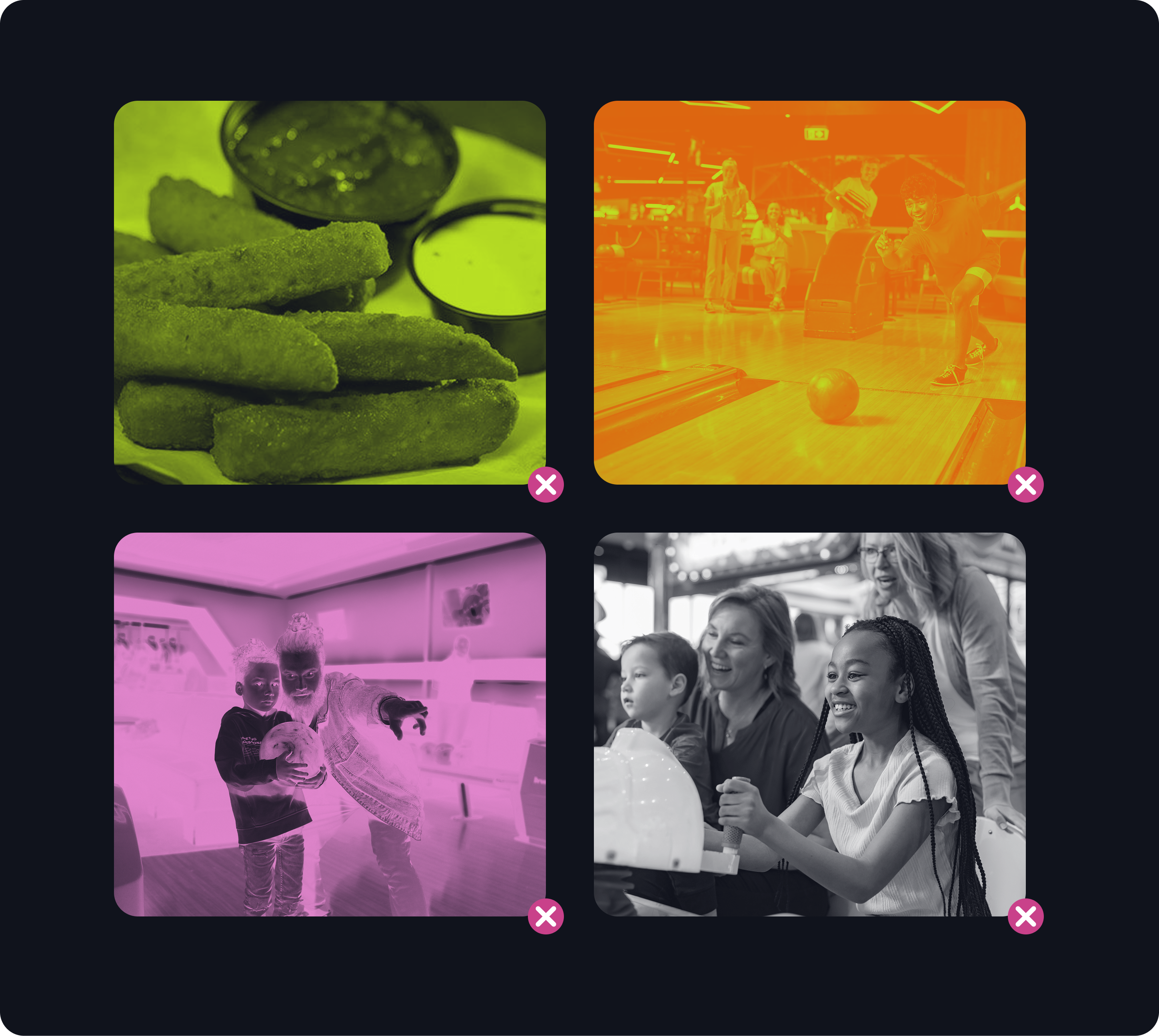
Duotone photos are made up of two (duo) contrasting colors (tones). This effect can be achieved using most design tools like Photoshop or Figma. Duotone photos can be used to bring texture and brand colors into design work. We recommend using full color photography when the photo is acting as the subject or hero of a design. Duotone imagery is recommended for use when text or graphics are intended to be the focus and the photo is simply adding a little texture/color.
When applying the duotone effect for FatCats we recommend using a single brand color paired with Night.
5d
Duotone Don’ts
It is important to maintain consistency with FatCats’ photography. Here is a list of things to avoid when applying the duotone effect:
Don’t use unappetizing colors for food.
Don’t mix colors. Apply one brand color and use night as the dark tone.
Don’t invert images to make the highlights dark and the shadows light. Creepy!
Don’t make images appear black & white. This lacks the energetic vibrancy of the FatCats brand.
06
Illustrations
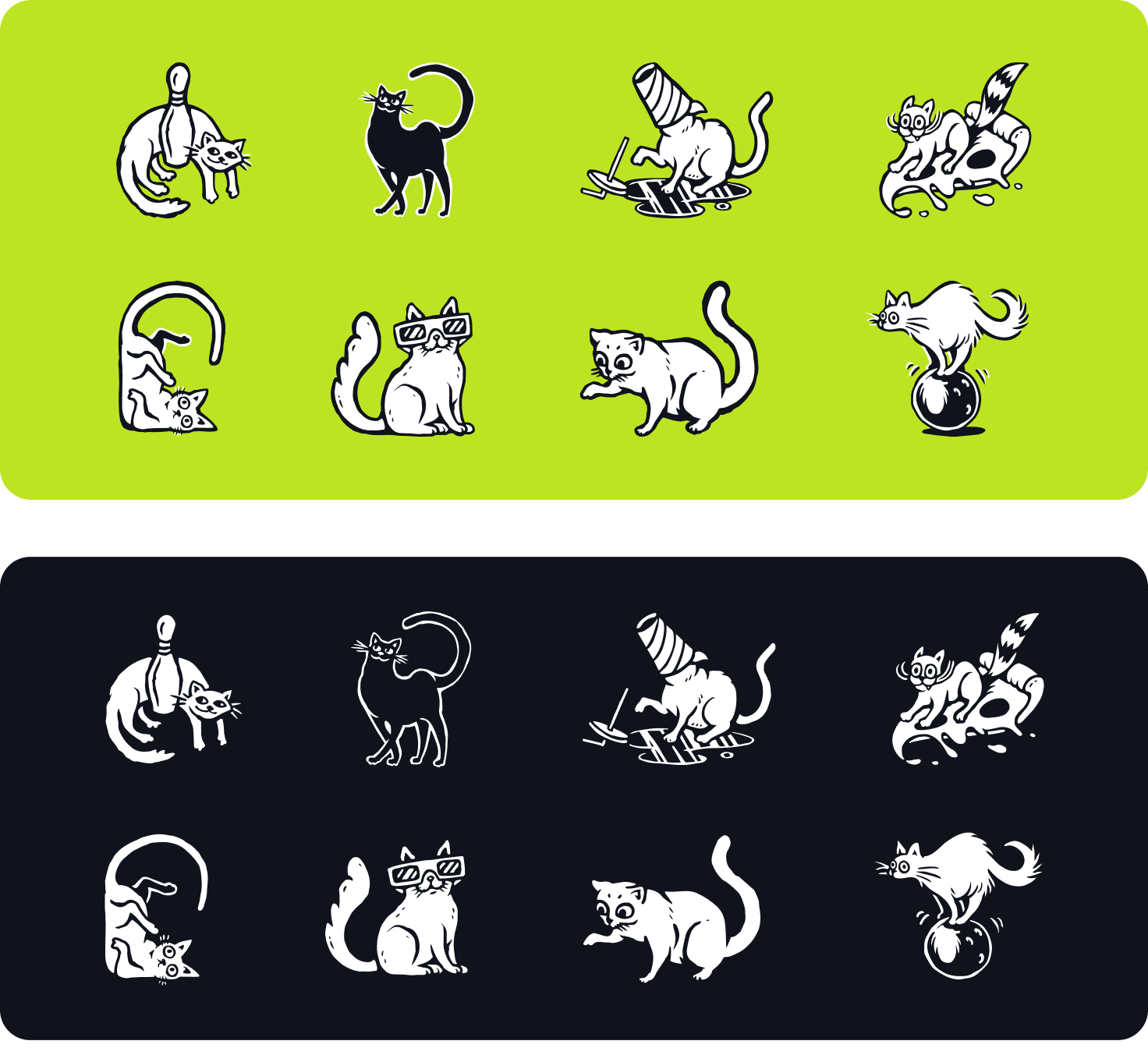
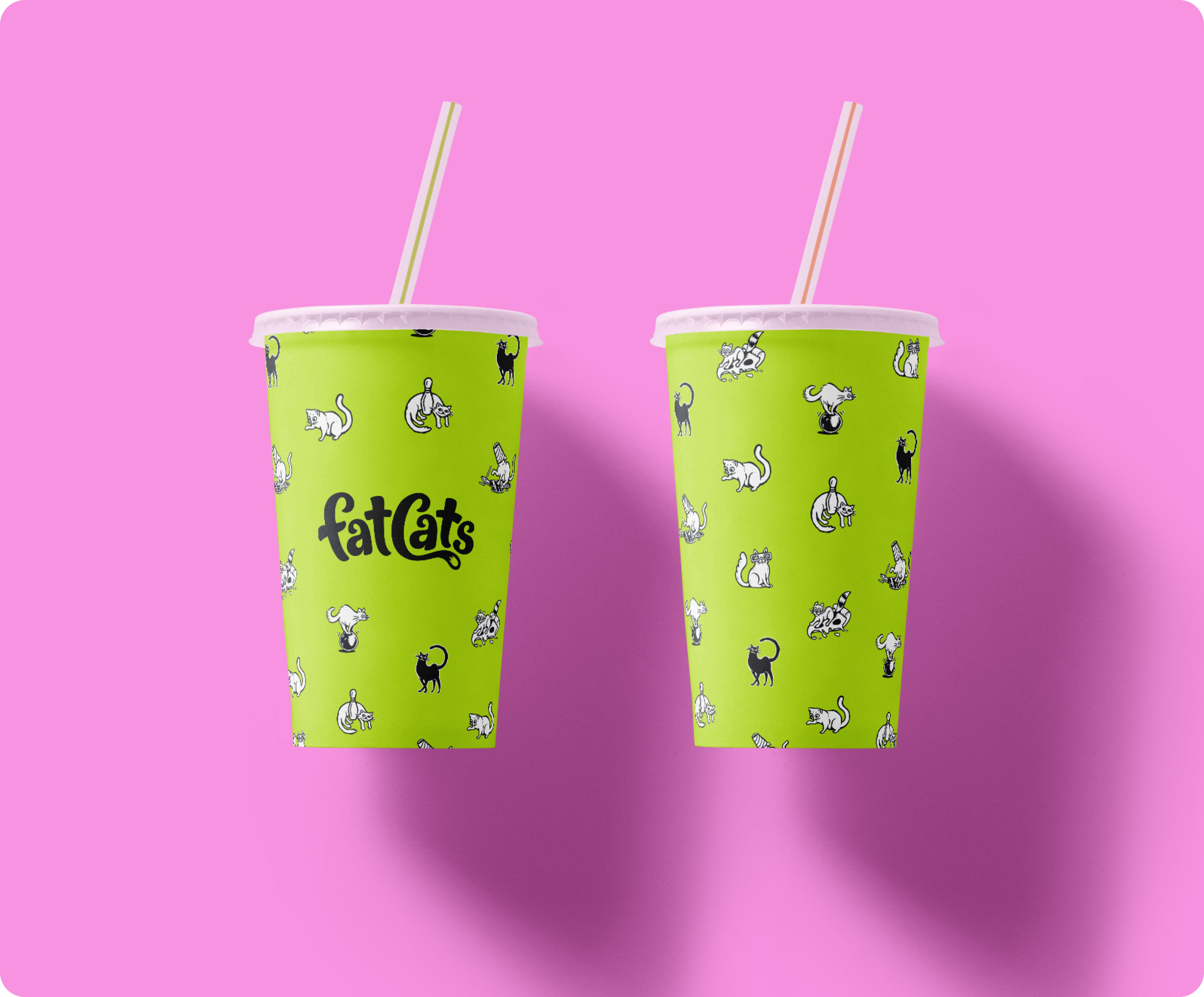
FatCats uses a collection of illustrated cats as decorative supporting elements in designs. These illustrations should be rendered in a consistent style reminiscent of ink drawings. The line work should be loose but highly intentional. These cats should look and behave like cats, and not be anthropomorphic (having human-like proportions). To add humour and charm incorporate something out of the ordinary to the illustrations like an odd position or unexpected prop.
Cat illustrations are rendered in 2 colors (light and dark) so they work on light or dark surfaces.
6a
hierarchy
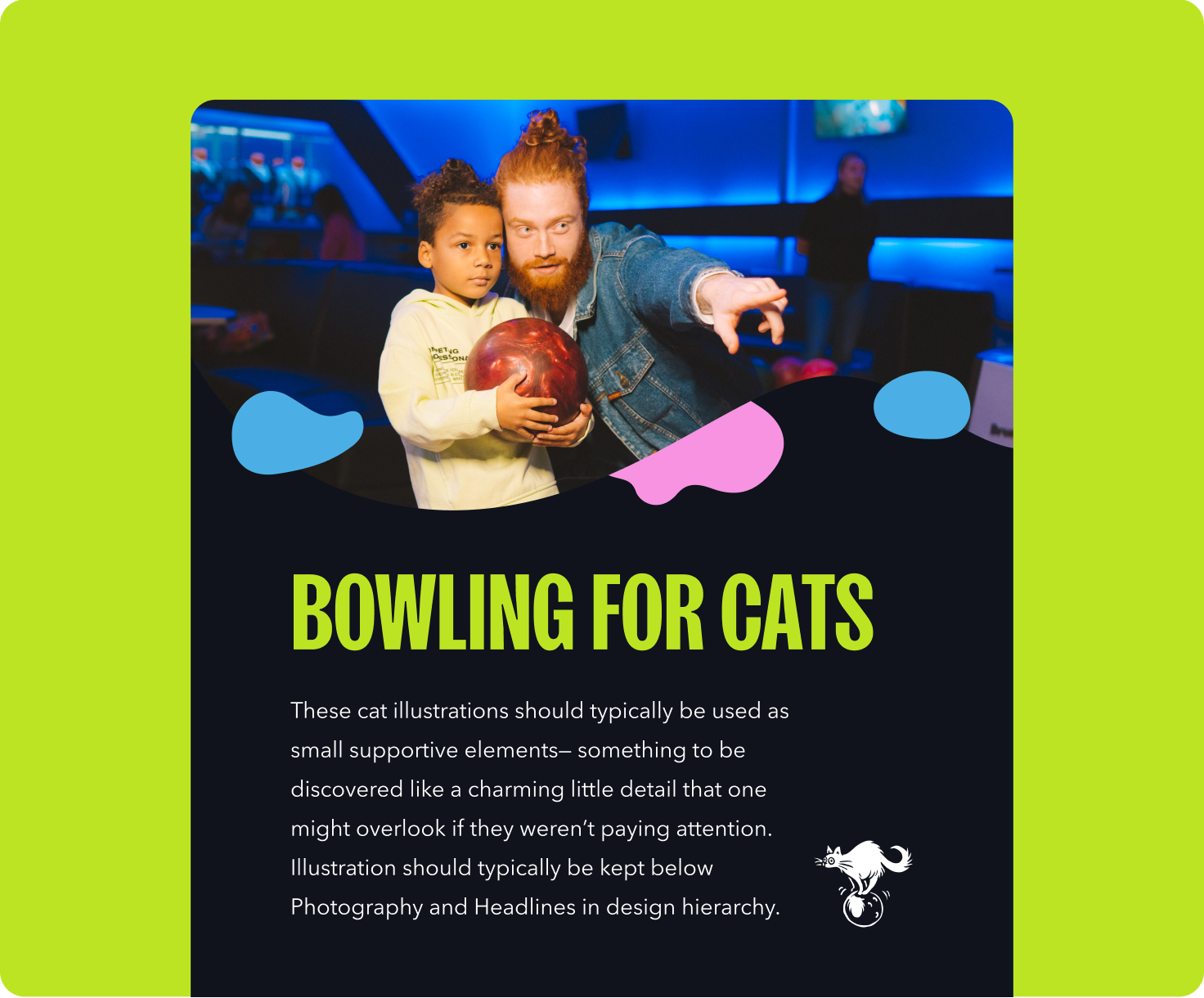
These cat illustrations are intended to be used as small supportive elements— a charming little detail that viewers can discover. They should typically be kept below Photography and Headlines in the hierarchy of a design.
An example of good hierarchy:
- Photography
- Headline
- Illustration
- body copy
6b
Illustration Don’ts
It is important to maintain consistency with the FatCats illustrations. Here is a list of things to avoid when creating, selecting, or designing with illustrations.
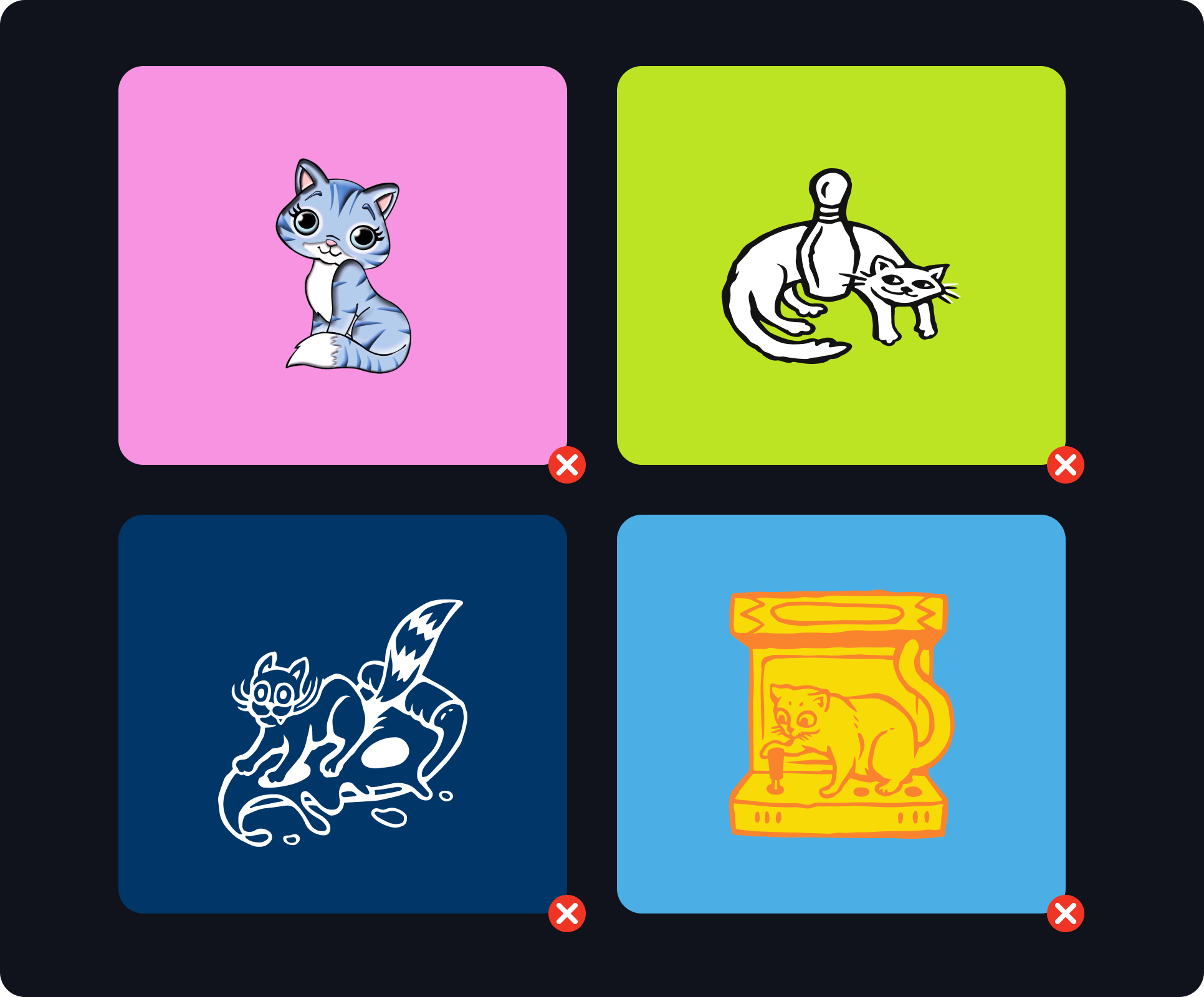
Don’t use illustrations that fail to match the FatCats branded illustration style.
Don’t edit or alter approved illustrations.
Don’t invert the images color to make the linework light and the fill dark.
Don’t use unapproved color combinations (see Contrast page in Color section).
6c
Examples
07
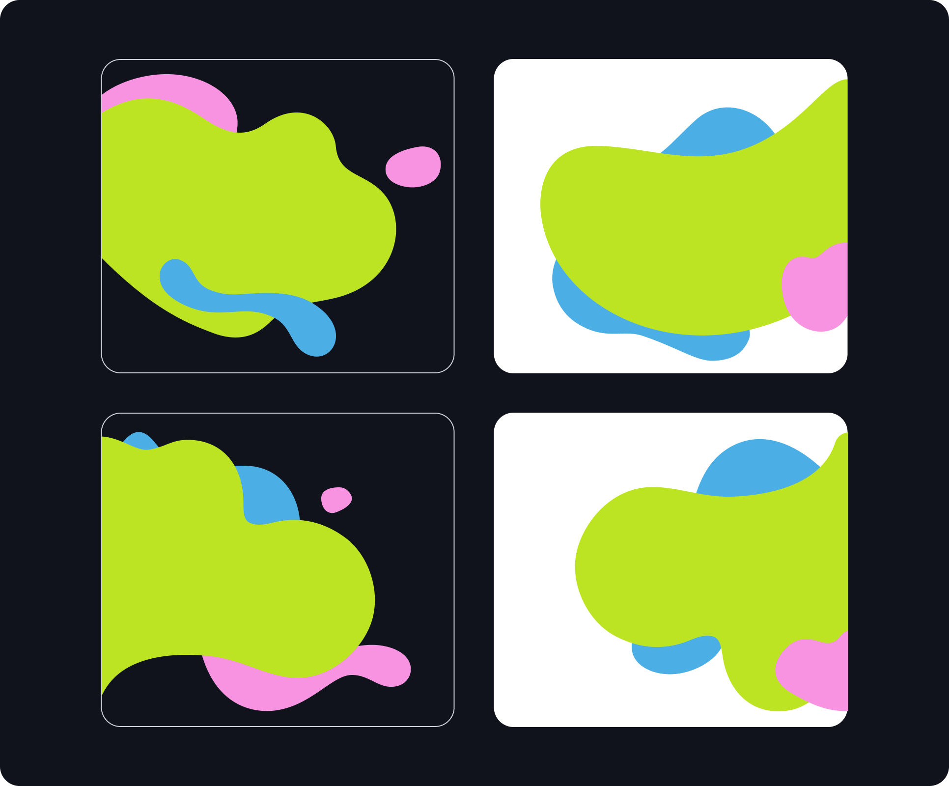
Flowing Forms
FatCats uses a collection of organic flowing forms as decorative supporting elements in designs. These should be rendered in a consistent style that has playful energy without appearing chaotic or accidental. Flowing forms can be used to reinforce the brand while bringing color, movement, and personality into designs.
Flowing Forms are limited to 3 colors max (2 colors when used to mask a photo). This helps to keep designs from appearing messy or unintentional.
7a
Diverse but not random
Though they may appear to be random, all of the shapes used in the Flowing Forms design element are derived from the FatCats logo. Some shapes outline a single character, some trace multiple letters, while others draw from a section of a letter.
A library of core shapes is available to be used as building blocks for creating new layouts. There is also a collection of pre-designed layouts available for use.
7b
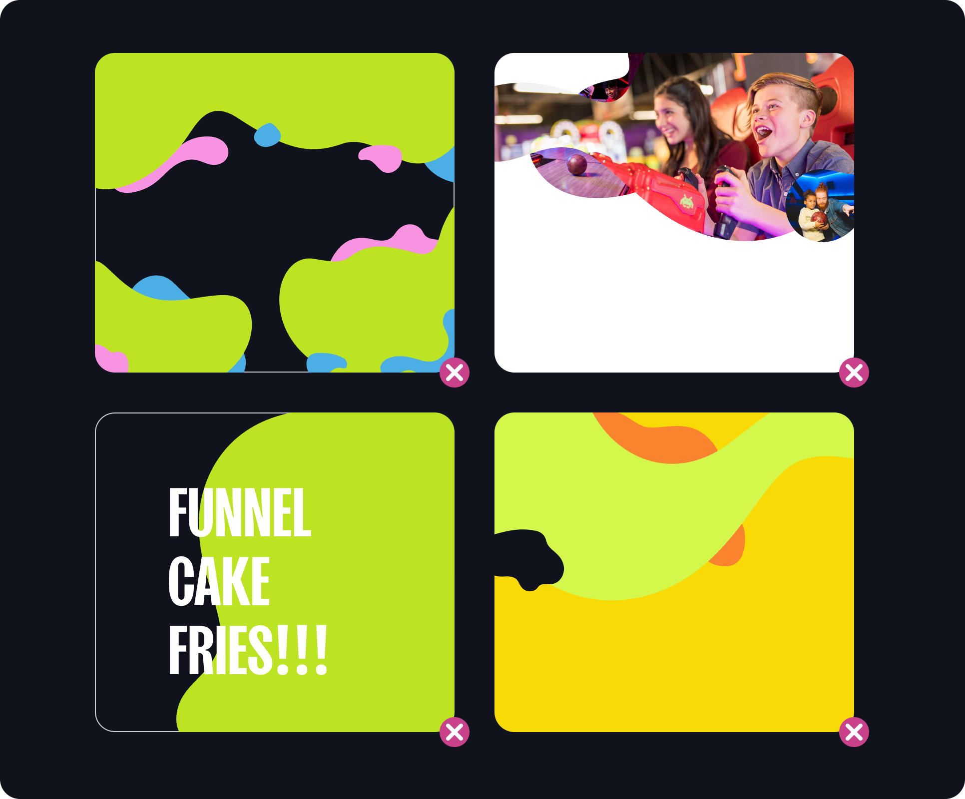
Floating layouts
We created a collection of free floating layouts that can be used in a broad variety of applications. These layouts look good when they spill off the edge of a page on one side with ample negative space above and below. Any elements placed over a floating layout should have high contrast against the colors and/or image.
7c
Floating Forms example
The floating form design element works well as a mask for full color or duotone photography. Be thoughtful about what colors you apply to the shapes in the multi-color layouts. You want to maintain attractive contrast against photography and any overlaid design elements like graphics or typography.
The floating form design element works well as a mask for full color or duotone photography. Be thoughtful about what colors you apply to the shapes in the multi-color layouts. You want to maintain attractive contrast against photography and any overlaid design elements like graphics or typography.
7d
breaking out
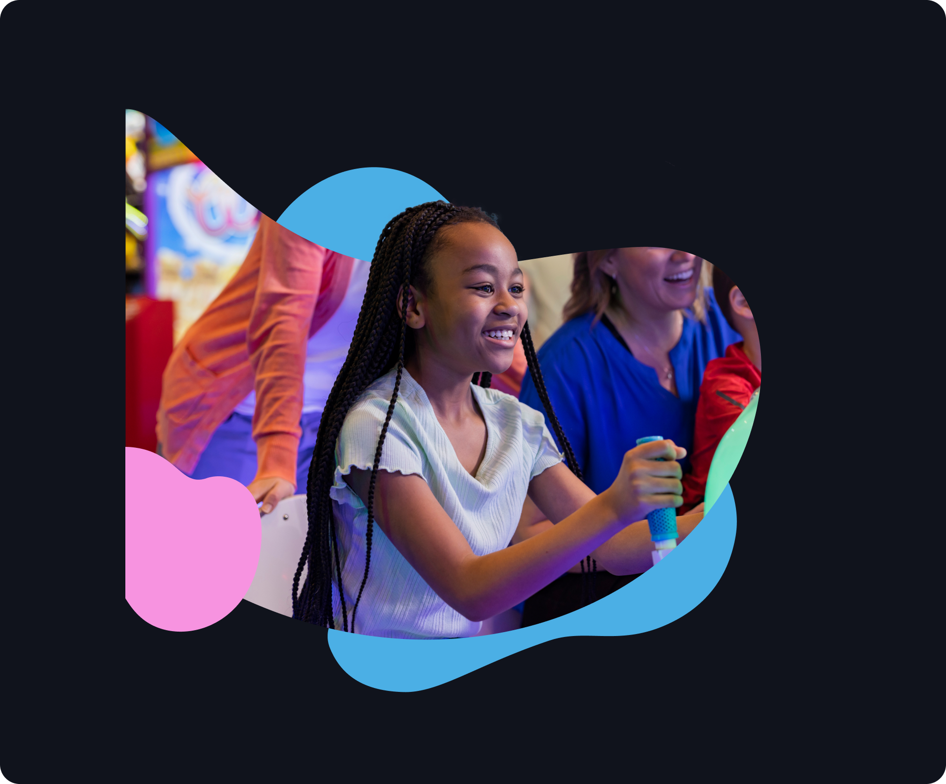
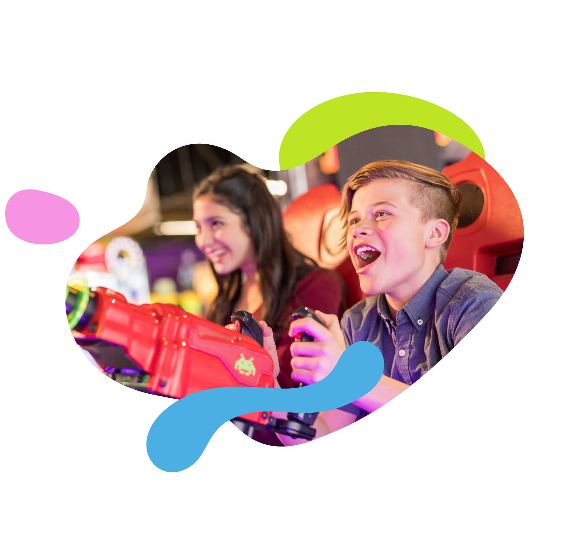
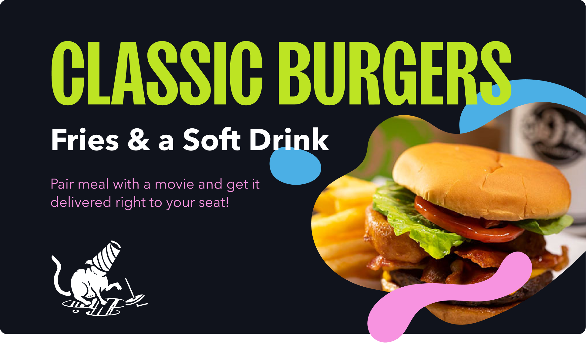
In some instances designers are encouraged to create layouts in which the subject of an image breaks out of the flowing form mask. This can add depth and diversity to a design. When breaking photographic elements out of a masked shape be sure to create a clean cutout of the subject and layer it seamlessly over the top of the masked image. We recommend using photoshop for this, as it has the most effective and user-friendly tools for selecting and masking images. Only allow the image to break out of the frame slightly to create a subtle effect.
7e
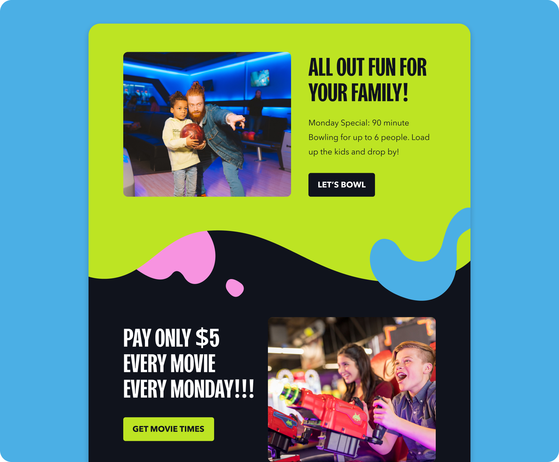
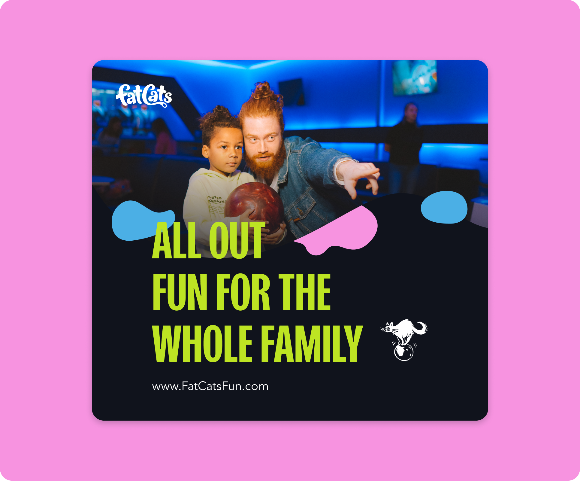
Full Page Layouts
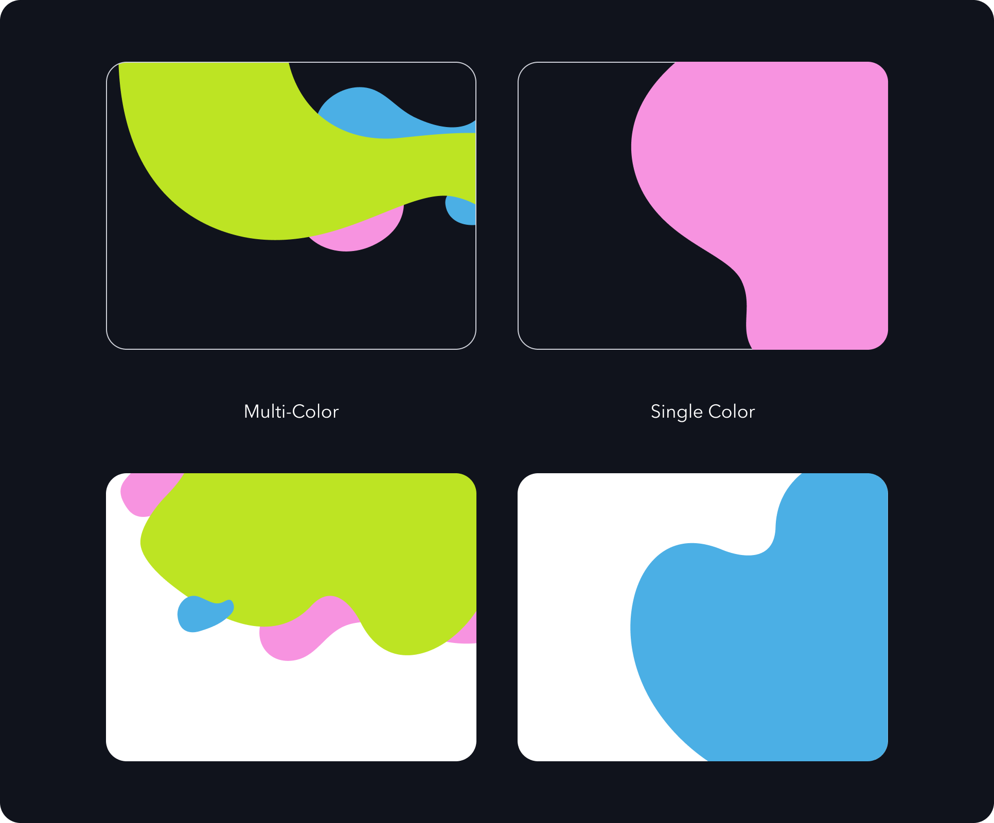
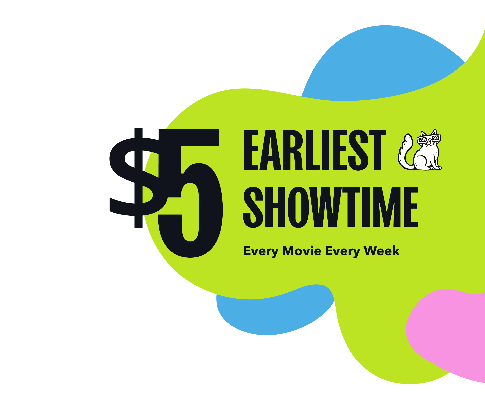
We created a collection of layouts intended to be used as full screen (hero) images. These layouts look good when they fill a space— spilling of the page on multiple sides. Mask a full color or duotone photo into the largest shape to incorporate imagery in a playful and dynamic way.
Any elements placed over a full page layout should have high contrast against the colors and/or image.
7f
Color Transitions
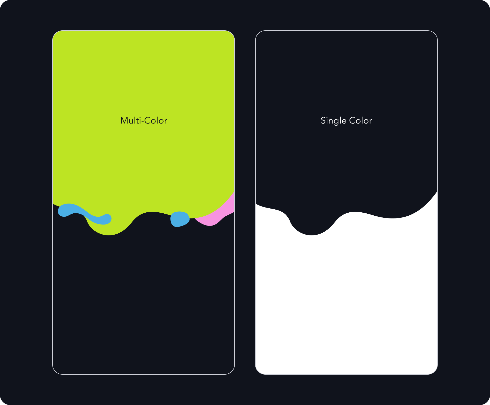
The Flowing Forms theme can be used to create transitions from one background color to the next. There is a collection of layouts available for use to change background colors in a design. Having branded background transitions can be an attractive way of adding visual variety to websites or tall compositions.
7g
Things to avoid
It is important to maintain consistency. Here’s a list of things to avoid when designing with flowing forms.
Don’t overload designs with flowing forms. Use shapes with discretion.
Don’t use smaller shapes as image masks.
Don’t create visual tangents when placing text or graphics over flowing forms.
Don’t use low contrast color combinations.
Don’t use unapproved color combinations (see Contrast page in Color section).
08
Putting it all together

Submit a Creative Request
Made with 💙 in Salt Lake City by Underbelly Creative.

Menu
Brand Guidelines
The FatCats brand is vibrant, bold, and charmingly imperfect. The visual design system thoughtfully combines a punchy palette, strong type, energetic photography, and organic design elements to create a carefully balanced identity optimized for our guests and community.
01
Who we are
The FatCats logo has been crafted to possess an energetic, hand-drawn quality, with careful consideration to the spacing, balance, and scalability of the design. The wordmark pays homage to the old FatCats logo with a more clean, bold, and contemporary execution.
1a
Fatcats’ mission
1B
Fatcats’ story
FatCats began in 1999 on the back of a napkin, when two friends, Dave Rutter and Sean Collins both entrepreneurs, wanted to create an environment where families could enjoy quality food, superior entertainment, and a world-class guest experience...or “All Out Fun” as they called it, all under one roof. A few simple plans with a bowling area, miniature glow golf, and a spacious arcade along with a bar-style grill were sketched out, and shortly thereafter in August 2001, the first FatCats opened just south of 3300 South in Millcreek, a suburb of Salt Lake City, UT.
FatCats in Salt Lake City was eagerly embraced by the community for its fresh take on bowling and great food where families and guests of all ages and skill levels could come and enjoy their time with one another. After seeing the community’s acceptance of the brand, Sean and Dave expanded with the opening of a location in Provo, UT in 2002. In 2007, a third FatCats in downtown Ogden, UT was added. One of their biggest expansions occurred in 2010, with the opening of two locations in the same year. One in Westminster, CO, and the other in Rexburg, ID. Rexburg was their first location that included a movie theater.
In 2015, they expanded upon the movie theater concept with a new centre in Gilbert, Arizona featuring all-reclining luxury seating along with 20 lanes of bowling, indoor glow miniature golf, and a massive arcade. The concept proved successful and since then, locations in Saratoga Springs, UT, Mesa, AZ, and Queen Creek, AZ have been added. All following the same concept but with an improved design. Currently under construction are locations in Surprise AZ, Bluffdale UT, and Clinton UT. As FatCats continues to grow, we are committed to providing all our guests with unforgettable experiences they can share with their families and friends.
1c
Brand attributes
The FatCats brand is vibrant, bold, and charmingly imperfect. The visual design system thoughtfully combines a punchy palette, strong type, energetic photography, and organic design elements to create a carefully balanced identity optimized for our guests and community. Consider these descriptive terms when producing anything for the FatCats brand. FatCats is...
02
Logo
The FatCats logo has been crafted to possess an energetic, hand-drawn quality, with careful consideration to the spacing, balance, and scalability of the design. The wordmark pays homage to the old FatCats logo with a more clean, bold, and contemporary execution.
2a
Primary Logo
The FatCats logo has been crafted to possess an energetic, hand-drawn quality, with careful consideration to the spacing, balance, and scalability of the design. The wordmark pays homage to the old FatCats logo with a more clean, bold, and contemporary execution.
2B
Layout variations
The FatCats logo system contains responsive variations of the FatCats logo. The primary logo should be the default for branded applications. The logo badge can be used to add visual weight or when reinforcing the connection between the old logo and the new. The monograms should be limited to situations where the viewer already knows the name of the company or they can see it elsewhere in the designed space.
2c
Recommended Color
While the FatCats brand is colorful and varied, we recommend using Lime Green for the logo when possible. This helps to reinforce the connection between the logo and the main brand color.
Lime Green does not have good contrast over white, so for applications on a white or light surface you can use the badge to incorporate the main brand color.
2d
Clearspace
There should always be a generous amount of space around the FatCats’ logo to give it visual weight and room to breathe. If this space is missing, the logo will feel cramped and off brand. Be mindful of spacing and make sure there is enough room around the logo when making decisions on size and placement.
2e
Size Variations
The FatCats logo was designed to be highly scalable. However, there is a limit to how small the logo can be displayed before it loses legibility. If the logo is 50px wide and above, default to the primary logo or circle badge. For use in print this translates to 0.5” and up. If the logo is presented at less than 50px wide (or less than 0.5” in print) we recommend using the round or square monogram.
2f
Color combinations
The logo should be presented in approved brand colors with high contrast against their respective backgrounds. This both reinforces the brand identify and improves visual accessibility. When placing a one color logo over a white background be sure to use the dark version of the primary colors or the logo will not have enough contrast.
The logo should be presented in approved brand colors with high contrast against their respective backgrounds. This both builds the brand and improves accessibility. Here are some examples of color combinations that are on brand and offer good contrast. Go the the Color section of this guide to see a more comprehensive list of high contrast color combinations.
2g
two-color logo
We recommend using a one color logo for most FatCats applications. However, in the interest of adding variety and flexibility to the brand we have created a two color version of the badge. This allows us to incorporate the primary colors (lime, grapefruit, & blueberry) into applications with white backgrounds while maintaining high contrast. We are not recommending using the two color badge over a dark background. The primary brand colors offer great contrast over dark backgrounds so a single color logo works best.
2h
Incorrect Usage
2i
Partnerships
03
Color
The colors used for FatCats reflect the brand attributes. They are vibrant, playful, and versatile. The colors were inspired by clean citrus fruits and bright neon signs.
3a
Color Palette
3b
The New Black
Because FatCats does not have pure black (#000000) in our color palette, anytime you would use black use Grey 06/Night (#10131C) instead. Blackberry (#003668) is a suitable substitution for black as well. This will help promote FatCats’ visual identity and help keep things consistent.
3c
Grayscale
3d
Proportions
The color proportions approximate how color should be used in branded material.
Negative space is an integral part of FatCats’ brand. Including ample breathing room between elements helps designs feel professional, clear, and calm.
3e
High Contrast
Maintain high contrast with all important design elements. This is especially true for text and UI components. High contrast (AAA) as defined by the WCAG requires a contrast ratio of at least 7:1 for normal text and 4.5:1 for large text. Large text is defined as 14 point and bold or larger, or 18 point or larger.
As a general rule, use all of the bright brand colors over dark backgrounds (Night, Blackberry, or Watermelon)— or use light/bright colors as a background and place dark colors over them. Easy!
3f
Low Contrast
Avoid low contrast combinations for any important content (something the viewer needs to see).
In some instances low contrast color combinations can be used to add visual interest or texture to a design, but be mindful that this low contrast content will not be visible to everyone.
04
type and Spacing
The typefaces for FatCats are Sans Plomb and Avenir Next.
Sans Plomb is a grotesque family inspired by the automotive world of the 80’s: from gas station signs to spare part brands, the font takes us back a few decades, when typefaces were somehow imperfect — and beautiful for that. It’s the perfect family for huge display titles.
Avenir Next is a new take on a classic font—it’s the result of a project whose goal was to take a beautifully designed sans and update it so that its technical standards surpass the status quo, leaving us with a truly superior sans family.


4a
Typescale
The FatCats type scale is different size of type that may be used for anything and everything associated with the brand. Use these guidelines for sizing and spacing of type. The type is built on a 18px type base (or 1 rem). The line-height (space between lines of text) is 1x (or 100%) for Sans Plomb headers and 1.75x (or 175%) for body and meta text.
The line-height (space between lines of text) is 1x (or 100%) for Sans Plomb headers and 1.75x (or 175%) for body and meta text.
The line-height (space between lines of text) is 1x (or 100%) for Sans Plomb headers and 1.75x (or 175%) for body and meta text.
4b
rhythm
Rhythm is a visual tempo or beat and is also called movement. It is often achieved through the careful placement of repeated components which invite the viewer's eye to jump rapidly or jump smoothly from one point to another. It refers to the spacing around different blocks of text.
The closeness between lines of text helps it feel friendlier and playful. It will help readers follow smoothly and easily and if you use this everywhere you have type, it will all stay on brand.
The type rhythm uses 0.4x (or 40%) for the header type sizes and 1.75x (or 175%) for body / paragraph and small text.
4c
Type Spacing
The spacing scale for FatCats refers to how distant elements should be from one another. This will ensure all communications remain consistent and thoughtful.
This scale was determined by using a minor third (1.2). Each size beyond the base of 18 px goes up by x1.2, rounded to the nearest whole pixel. The type scale was chosen based on this spacing scale and the specific spacing recommendations were chosen from the same scale.
You may use any of the sizes in this scale, but we recommend sticking with the five specified spacing sizes.
05
Photography guidelines
Photography is an important part of the FatCats brand. By showing diverse, relatable people having fun together we communicate our goal of delighting and connecting people. Photos should be fun, genuine, colorful, and uplifting. Whenever possible use custom photography captured in a FatCats facility.
5a
examples
5b
Things to avoid
When creating or selecting photography for FatCats consider the following:
Don’t use images that appear overly staged. This includes cheesy expressions or subjects that aren’t relatable.
Don’t use images that are chaotic or messy.
Don’t use images that showcase people worried, upset or in a negative mood.
Don’t use images with noticeable filters, moody lighting, or visual effects.
Don’t use images that aren’t family friendly.
5c
Duotone Colors
Duotone photos are made up of two (duo) contrasting colors (tones). This effect can be achieved using most design tools like Photoshop or Figma. Duotone photos can be used to bring texture and brand colors into design work. We recommend using full color photography when the photo is acting as the subject or hero of a design. Duotone imagery is recommended for use when text or graphics are intended to be the focus and the photo is simply adding a little texture/color.
When applying the duotone effect for FatCats we recommend using a single brand color paired with Night.
5d
Duotone Don’ts
It is important to maintain consistency with FatCats’ photography. Here is a list of things to avoid when applying the duotone effect:
Don’t use unappetizing colors for food.
Don’t mix colors. Apply one brand color and use night as the dark tone.
Don’t invert images to make the highlights dark and the shadows light. Creepy!
Don’t make images appear black & white. This lacks the energetic vibrancy of the FatCats brand.
06
Illustrations
FatCats uses a collection of illustrated cats as decorative supporting elements in designs. These illustrations should be rendered in a consistent style reminiscent of ink drawings. The line work should be loose but highly intentional. These cats should look and behave like cats, and not be anthropomorphic (having human-like proportions). To add humour and charm incorporate something out of the ordinary to the illustrations like an odd position or unexpected prop.
Cat illustrations are rendered in 2 colors (light and dark) so they work on light or dark surfaces.
6a
hierarchy
These cat illustrations are intended to be used as small supportive elements— a charming little detail that viewers can discover. They should typically be kept below Photography and Headlines in the hierarchy of a design.
An example of good hierarchy:
- Photography
- Headline
- Illustration
- body copy
6b
Illustration Don’ts
It is important to maintain consistency with the FatCats illustrations. Here is a list of things to avoid when creating, selecting, or designing with illustrations.
Don’t use illustrations that fail to match the FatCats branded illustration style.
Don’t edit or alter approved illustrations.
Don’t invert the images color to make the linework light and the fill dark.
Don’t use unapproved color combinations (see Contrast page in Color section).
6c
Examples
07
Flowing Forms
FatCats uses a collection of organic flowing forms as decorative supporting elements in designs. These should be rendered in a consistent style that has playful energy without appearing chaotic or accidental. Flowing forms can be used to reinforce the brand while bringing color, movement, and personality into designs.
Flowing Forms are limited to 3 colors max (2 colors when used to mask a photo). This helps to keep designs from appearing messy or unintentional.
7a
Typescale
Though they may appear to be random, all of the shapes used in the Flowing Forms design element are derived from the FatCats logo. Some shapes outline a single character, some trace multiple letters, while others draw from a section of a letter.
A library of core shapes is available to be used as building blocks for creating new layouts. There is also a collection of pre-designed layouts available for use.
7b
Floating layouts
We created a collection of free floating layouts that can be used in a broad variety of applications. These layouts look good when they spill off the edge of a page on one side with ample negative space above and below. Any elements placed over a floating layout should have high contrast against the colors and/or image.
7c
Floating Forms example
The floating form design element works well as a mask for full color or duotone photography. Be thoughtful about what colors you apply to the shapes in the multi-color layouts. You want to maintain attractive contrast against photography and any overlaid design elements like graphics or typography.
The floating form design element works well as a mask for full color or duotone photography. Be thoughtful about what colors you apply to the shapes in the multi-color layouts. You want to maintain attractive contrast against photography and any overlaid design elements like graphics or typography.
7d
breaking out
In some instances designers are encouraged to create layouts in which the subject of an image breaks out of the flowing form mask. This can add depth and diversity to a design. When breaking photographic elements out of a masked shape be sure to create a clean cutout of the subject and layer it seamlessly over the top of the masked image. We recommend using photoshop for this, as it has the most effective and user-friendly tools for selecting and masking images. Only allow the image to break out of the frame slightly to create a subtle effect.
7e
Full Page Layouts
We created a collection of layouts intended to be used as full screen (hero) images. These layouts look good when they fill a space— spilling of the page on multiple sides. Mask a full color or duotone photo into the largest shape to incorporate imagery in a playful and dynamic way.
Any elements placed over a full page layout should have high contrast against the colors and/or image.
7f
Color Transitions
The Flowing Forms theme can be used to create transitions from one background color to the next. There is a collection of layouts available for use to change background colors in a design. Having branded background transitions can be an attractive way of adding visual variety to websites or tall compositions.
7g
Things to avoid
It is important to maintain consistency. Here’s a list of things to avoid when designing with flowing forms.
Don’t overload designs with flowing forms. Use shapes with discretion.
Don’t use smaller shapes as image masks.
Don’t create visual tangents when placing text or graphics over flowing forms.
Don’t use low contrast color combinations.
Don’t use unapproved color combinations (see Contrast page in Color section).
08
Putting it all together
Submit a Creative Request
Made with 💙 in Salt Lake City by Underbelly Creative.

Logo
01
Color
02
Typography
03
Putting it all together
04
Submit a Creative Request
Brand Guidelines
The FatCats brand is vibrant, bold, and charmingly imperfect. The visual design system thoughtfully combines a punchy palette, strong type, energetic photography, and organic design elements to create a carefully balanced identity optimized for our guests and community.
01
Who we are
The FatCats logo has been crafted to possess an energetic, hand-drawn quality, with careful consideration to the spacing, balance, and scalability of the design. The wordmark pays homage to the old FatCats logo with a more clean, bold, and contemporary execution.
1a
Fatcats’ mission
1B
Fatcats’ story
FatCats began in 1999 on the back of a napkin, when two friends, Dave Rutter and Sean Collins both entrepreneurs, wanted to create an environment where families could enjoy quality food, superior entertainment, and a world-class guest experience...or “All Out Fun” as they called it, all under one roof. A few simple plans with a bowling area, miniature glow golf, and a spacious arcade along with a bar-style grill were sketched out, and shortly thereafter in August 2001, the first FatCats opened just south of 3300 South in Millcreek, a suburb of Salt Lake City, UT.
FatCats in Salt Lake City was eagerly embraced by the community for its fresh take on bowling and great food where families and guests of all ages and skill levels could come and enjoy their time with one another. After seeing the community’s acceptance of the brand, Sean and Dave expanded with the opening of a location in Provo, UT in 2002. In 2007, a third FatCats in downtown Ogden, UT was added. One of their biggest expansions occurred in 2010, with the opening of two locations in the same year. One in Westminster, CO, and the other in Rexburg, ID. Rexburg was their first location that included a movie theater.
In 2015, they expanded upon the movie theater concept with a new centre in Gilbert, Arizona featuring all-reclining luxury seating along with 20 lanes of bowling, indoor glow miniature golf, and a massive arcade. The concept proved successful and since then, locations in Saratoga Springs, UT, Mesa, AZ, and Queen Creek, AZ have been added. All following the same concept but with an improved design. Currently under construction are locations in Surprise AZ, Bluffdale UT, and Clinton UT. As FatCats continues to grow, we are committed to providing all our guests with unforgettable experiences they can share with their families and friends.
1c
Brand attributes
The FatCats brand is vibrant, bold, and charmingly imperfect. The visual design system thoughtfully combines a punchy palette, strong type, energetic photography, and organic design elements to create a carefully balanced identity optimized for our guests and community. Consider these descriptive terms when producing anything for the FatCats brand. FatCats is...
02
Logo
The FatCats logo has been crafted to possess an energetic, hand-drawn quality, with careful consideration to the spacing, balance, and scalability of the design. The wordmark pays homage to the old FatCats logo with a more clean, bold, and contemporary execution.
2a
Primary Logo
The FatCats logo has been crafted to possess an energetic, hand-drawn quality, with careful consideration to the spacing, balance, and scalability of the design. The wordmark pays homage to the old FatCats logo with a more clean, bold, and contemporary execution.
2B
Layout variations
The FatCats logo system contains responsive variations of the FatCats logo. The primary logo should be the default for branded applications. The logo badge can be used to add visual weight or when reinforcing the connection between the old logo and the new. The monograms should be limited to situations where the viewer already knows the name of the company or they can see it elsewhere in the designed space.
2c
Recommended Color
While the FatCats brand is colorful and varied, we recommend using Lime Green for the logo when possible. This helps to reinforce the connection between the logo and the main brand color.
Lime Green does not have good contrast over white, so for applications on a white or light surface you can use the badge to incorporate the main brand color.
2d
Clearspace
There should always be a generous amount of space around the FatCats’ logo to give it visual weight and room to breathe. If this space is missing, the logo will feel cramped and off brand. Be mindful of spacing and make sure there is enough room around the logo when making decisions on size and placement.
2e
Size Variations
The FatCats logo was designed to be highly scalable. However, there is a limit to how small the logo can be displayed before it loses legibility. If the logo is 50px wide and above, default to the primary logo or circle badge. For use in print this translates to 0.5” and up. If the logo is presented at less than 50px wide (or less than 0.5” in print) we recommend using the round or square monogram.
2f
Color combinations
The logo should be presented in approved brand colors with high contrast against their respective backgrounds. This both reinforces the brand identify and improves visual accessibility. When placing a one color logo over a white background be sure to use the dark version of the primary colors or the logo will not have enough contrast.
The logo should be presented in approved brand colors with high contrast against their respective backgrounds. This both builds the brand and improves accessibility. Here are some examples of color combinations that are on brand and offer good contrast. Go the the Color section of this guide to see a more comprehensive list of high contrast color combinations.
2g
two-color logo
We recommend using a one color logo for most FatCats applications. However, in the interest of adding variety and flexibility to the brand we have created a two color version of the badge. This allows us to incorporate the primary colors (lime, grapefruit, & blueberry) into applications with white backgrounds while maintaining high contrast. We are not recommending using the two color badge over a dark background. The primary brand colors offer great contrast over dark backgrounds so a single color logo works best.
2h
Incorrect Usage
2i
Partnerships
03
Color
The colors used for FatCats reflect the brand attributes. They are vibrant, playful, and versatile. The colors were inspired by clean citrus fruits and bright neon signs.
3a
Color Palette
3b
The New Black
Because FatCats does not have pure black (#000000) in our color palette, anytime you would use black use Grey 06/Night (#10131C) instead. Blackberry (#003668) is a suitable substitution for black as well. This will help promote FatCats’ visual identity and help keep things consistent.
3c
Grayscale
3d
Proportions
The color proportions approximate how color should be used in branded material.
Negative space is an integral part of FatCats’ brand. Including ample breathing room between elements helps designs feel professional, clear, and calm.
3e
High Contrast
Maintain high contrast with all important design elements. This is especially true for text and UI components. High contrast (AAA) as defined by the WCAG requires a contrast ratio of at least 7:1 for normal text and 4.5:1 for large text. Large text is defined as 14 point and bold or larger, or 18 point or larger.
As a general rule, use all of the bright brand colors over dark backgrounds (Night, Blackberry, or Watermelon)— or use light/bright colors as a background and place dark colors over them. Easy!
3f
Low Contrast
Avoid low contrast combinations for any important content (something the viewer needs to see).
In some instances low contrast color combinations can be used to add visual interest or texture to a design, but be mindful that this low contrast content will not be visible to everyone.
04
type and Spacing
The typefaces for FatCats are Sans Plomb and Avenir Next.
Sans Plomb is a grotesque family inspired by the automotive world of the 80’s: from gas station signs to spare part brands, the font takes us back a few decades, when typefaces were somehow imperfect — and beautiful for that. It’s the perfect family for huge display titles.
Avenir Next is a new take on a classic font—it’s the result of a project whose goal was to take a beautifully designed sans and update it so that its technical standards surpass the status quo, leaving us with a truly superior sans family.

4a
Type scale
The FatCats type scale is different size of type that may be used for anything and everything associated with the brand. Use these guidelines for sizing and spacing of type. The type is built on a 18px type base (or 1 rem). The line-height (space between lines of text) is 1x (or 100%) for Sans Plomb headers and 1.75x (or 175%) for body and meta text.
The line-height (space between lines of text) is 1x (or 100%) for Sans Plomb headers and 1.75x (or 175%) for body and meta text.
The line-height (space between lines of text) is 1x (or 100%) for Sans Plomb headers and 1.75x (or 175%) for body and meta text.
4b
rhythm
Rhythm is a visual tempo or beat and is also called movement. It is often achieved through the careful placement of repeated components which invite the viewer's eye to jump rapidly or jump smoothly from one point to another. It refers to the spacing around different blocks of text.
The closeness between lines of text helps it feel friendlier and playful. It will help readers follow smoothly and easily and if you use this everywhere you have type, it will all stay on brand.
The type rhythm uses 0.4x (or 40%) for the header type sizes and 1.75x (or 175%) for body / paragraph and small text.
4c
Type Spacing
The spacing scale for FatCats refers to how distant elements should be from one another. This will ensure all communications remain consistent and thoughtful.
This scale was determined by using a minor third (1.2). Each size beyond the base of 18 px goes up by x1.2, rounded to the nearest whole pixel. The type scale was chosen based on this spacing scale and the specific spacing recommendations were chosen from the same scale.
You may use any of the sizes in this scale, but we recommend sticking with the five specified spacing sizes.
05
Photography guidelines
Photography is an important part of the FatCats brand. By showing diverse, relatable people having fun together we communicate our goal of delighting and connecting people. Photos should be fun, genuine, colorful, and uplifting. Whenever possible use custom photography captured in a FatCats facility.
5a
examples
5b
Things to avoid
When creating or selecting photography for FatCats consider the following:
Don’t use images that appear overly staged. This includes cheesy expressions or subjects that aren’t relatable.
Don’t use images that are chaotic or messy.
Don’t use images that showcase people worried, upset or in a negative mood.
Don’t use images with noticeable filters, moody lighting, or visual effects.
Don’t use images that aren’t family friendly.
5c
Duotone Colors
Duotone photos are made up of two (duo) contrasting colors (tones). This effect can be achieved using most design tools like Photoshop or Figma. Duotone photos can be used to bring texture and brand colors into design work. We recommend using full color photography when the photo is acting as the subject or hero of a design. Duotone imagery is recommended for use when text or graphics are intended to be the focus and the photo is simply adding a little texture/color.
When applying the duotone effect for FatCats we recommend using a single brand color paired with Night.
5d
Duotone Don’ts
It is important to maintain consistency with FatCats’ photography. Here is a list of things to avoid when applying the duotone effect:
Don’t use unappetizing colors for food.
Don’t mix colors. Apply one brand color and use night as the dark tone.
Don’t invert images to make the highlights dark and the shadows light. Creepy!
Don’t make images appear black & white. This lacks the energetic vibrancy of the FatCats brand.
06
Illustrations
FatCats uses a collection of illustrated cats as decorative supporting elements in designs. These illustrations should be rendered in a consistent style reminiscent of ink drawings. The line work should be loose but highly intentional. These cats should look and behave like cats, and not be anthropomorphic (having human-like proportions). To add humour and charm incorporate something out of the ordinary to the illustrations like an odd position or unexpected prop.
Cat illustrations are rendered in 2 colors (light and dark) so they work on light or dark surfaces.
6a
hierarchy
These cat illustrations are intended to be used as small supportive elements— a charming little detail that viewers can discover. They should typically be kept below Photography and Headlines in the hierarchy of a design.
An example of good hierarchy:
- Photography
- Headline
- Illustration
- body copy
6b
Illustration Don’ts
It is important to maintain consistency with the FatCats illustrations. Here is a list of things to avoid when creating, selecting, or designing with illustrations.
Don’t use illustrations that fail to match the FatCats branded illustration style.
Don’t edit or alter approved illustrations.
Don’t invert the images color to make the linework light and the fill dark.
Don’t use unapproved color combinations (see Contrast page in Color section).
6c
Examples
07
Flowing Forms
FatCats uses a collection of organic flowing forms as decorative supporting elements in designs. These should be rendered in a consistent style that has playful energy without appearing chaotic or accidental. Flowing forms can be used to reinforce the brand while bringing color, movement, and personality into designs.
Flowing Forms are limited to 3 colors max (2 colors when used to mask a photo). This helps to keep designs from appearing messy or unintentional.
7a
Diverse but not random
Though they may appear to be random, all of the shapes used in the Flowing Forms design element are derived from the FatCats logo. Some shapes outline a single character, some trace multiple letters, while others draw from a section of a letter.
A library of core shapes is available to be used as building blocks for creating new layouts. There is also a collection of pre-designed layouts available for use.
7b
Floating layouts
We created a collection of free floating layouts that can be used in a broad variety of applications. These layouts look good when they spill off the edge of a page on one side with ample negative space above and below. Any elements placed over a floating layout should have high contrast against the colors and/or image.
7c
Floating Forms example
The floating form design element works well as a mask for full color or duotone photography. Be thoughtful about what colors you apply to the shapes in the multi-color layouts. You want to maintain attractive contrast against photography and any overlaid design elements like graphics or typography.
The floating form design element works well as a mask for full color or duotone photography. Be thoughtful about what colors you apply to the shapes in the multi-color layouts. You want to maintain attractive contrast against photography and any overlaid design elements like graphics or typography.
7d
breaking out
In some instances designers are encouraged to create layouts in which the subject of an image breaks out of the flowing form mask. This can add depth and diversity to a design. When breaking photographic elements out of a masked shape be sure to create a clean cutout of the subject and layer it seamlessly over the top of the masked image. We recommend using photoshop for this, as it has the most effective and user-friendly tools for selecting and masking images. Only allow the image to break out of the frame slightly to create a subtle effect.
7e
Full Page Layouts
We created a collection of layouts intended to be used as full screen (hero) images. These layouts look good when they fill a space— spilling of the page on multiple sides. Mask a full color or duotone photo into the largest shape to incorporate imagery in a playful and dynamic way.
Any elements placed over a full page layout should have high contrast against the colors and/or image.
7f
Color Transitions
The Flowing Forms theme can be used to create transitions from one background color to the next. There is a collection of layouts available for use to change background colors in a design. Having branded background transitions can be an attractive way of adding visual variety to websites or tall compositions.
7g
Things to avoid
It is important to maintain consistency. Here’s a list of things to avoid when designing with flowing forms.
Don’t overload designs with flowing forms. Use shapes with discretion.
Don’t use smaller shapes as image masks.
Don’t create visual tangents when placing text or graphics over flowing forms.
Don’t use low contrast color combinations.
Don’t use unapproved color combinations (see Contrast page in Color section).
08
Putting it all together
Submit a Creative Request
Made with 💙 in Salt Lake City by Underbelly Creative.