
Menu
Logo
01
Color
02
Typography
03
Putting it all together
04

Submit a Creative Request

Brand Guidelines
The FatCats brand is vibrant, bold, and charmingly imperfect. The visual design system thoughtfully combines a punchy palette, strong type, energetic photography, and organic design elements to create a carefully balanced identity optimized for our guests and community.
01
Logo
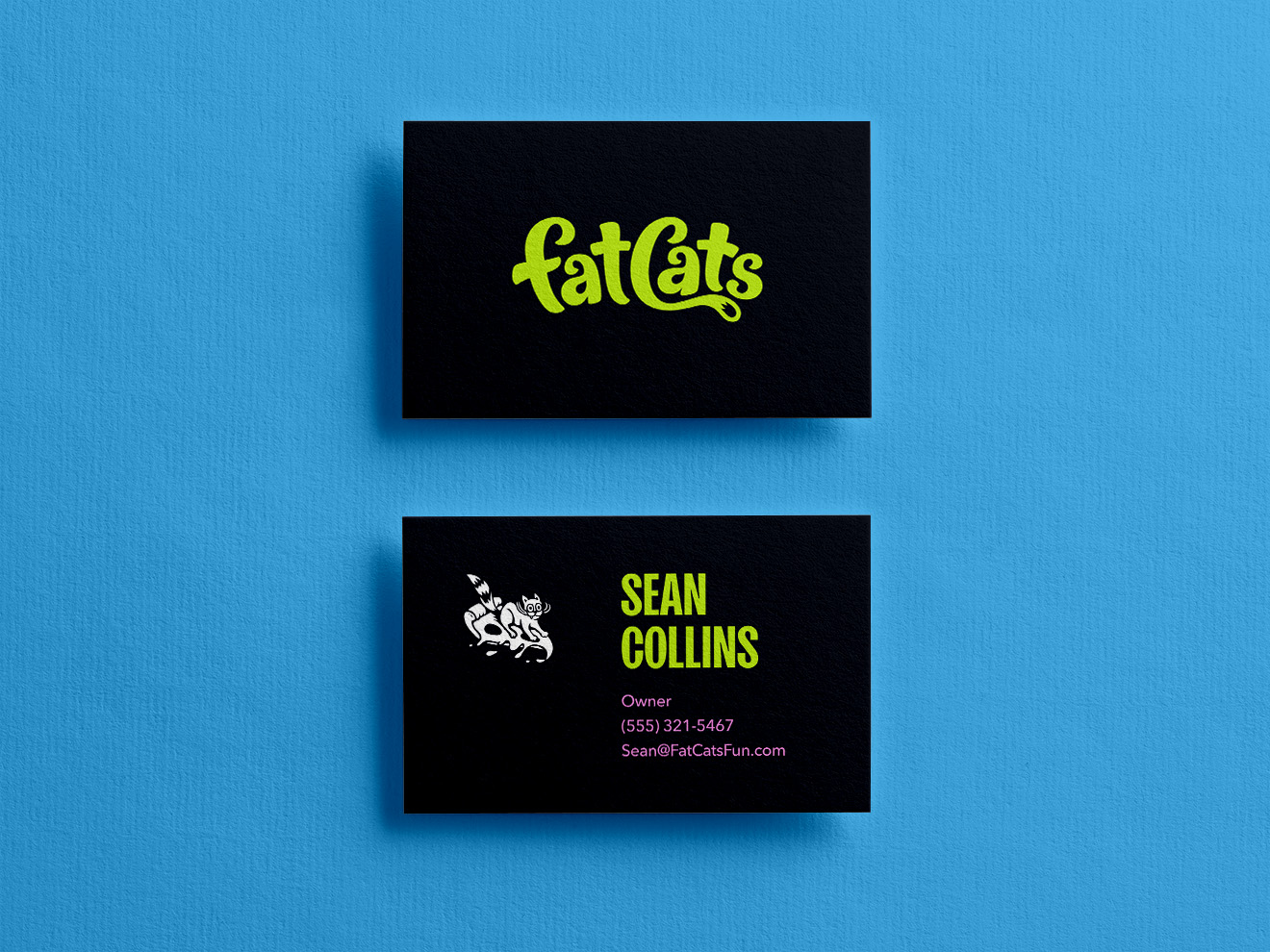
The FatCats logo has been crafted to possess an energetic, hand-drawn quality, with careful consideration to the spacing, balance, and scalability of the design. The wordmark pays homage to the old FatCats logo with a more clean, bold, and contemporary execution.
1a
Primary Lockup

1b
Clearspace


1c
Layout variations

The primary logo should be the default for branded applications. The logo badge can be used to add visual weight or when reinforcing the connection between the old logo and the new. The monograms should be limited to situations where the viewer already knows the name of the company or they can see it elsewhere in the designed space.
1c
two-color logo

We recommend using a one color logo for most FatCats applications. However, in the interest of adding variety and flexibility to the brand we have created a two color version of the badge. This allows us to incorporate the primary colors (lime, grapefruit, & blueberry) into applications with white backgrounds while maintaining high contrast.
1d
Incorrect Usage


Don’t alter the logo proportions in any way.
Don’t tilt the logo at odd angles.
Don’t use it over unapproved colors.
Don’t place it over busy imagery.
Don’t apply effects or textures to the logo.
1e
Partnerships

02
Color
The colors used for FatCats reflect the brand attributes. They are vibrant, playful, and versatile. The colors were inspired by clean citrus fruits and bright neon signs.
2a
Primary Palette
Lime
#BDE423
RGB 189, 228, 35
CMYK 36, 0, 100, 0
Pantone 375 C

Grapefruit
#F793E0
RGB 247, 147, 224
CMYK 4, 52, 0, 0
Pantone 211 C

Blueberry
#4BAFE5
RGB 75, 175, 229
CMYK 71, 10, 0, 0
Pantone 2191 C

Lemon
#F8DA07
RGB 248, 218, 7
CMYK 3, 11, 100, 0
Pantone 3955 C

Orange
#FA842E
RGB 250, 132, 46
CMYK 0, 64, 100, 0
Pantone 151 C

Blackberry
RGB 0, 54, 104
CMYK 100, 83, 32, 21
Pantone 3591 C

Watermelon
#025500
RGB 2, 85, 0
CMYK 89, 38, 100, 38
Pantone 349 C

2b
Secondary Palette
White
#FFFFFF
RGB 255, 255, 255
CMYK 0, 0, 0, 0
Gray 01
#F8F9FD
RGB 248, 249, 253
CMYK 2, 1, 0, 0
Pantone Cool Gray 1 C
Gray 02
#EBEDF3
RGB 235, 237, 243
CMYK 6, 4, 1, 0
Pantone 427 C
Gray 03
#CED0D8
RGB 206, 208, 216
CMYK 18, 13, 9, 0
Pantone 428 C
Gray 04
#878B99
RGB 135, 139, 153
CMYK 51, 41, 30, 2
Pantone 429 C
Gray 05
#393E50
RGB 57, 62, 80
CMYK 80, 71, 46, 37
Pantone 431 C
Gray 06 / Night
#10131C
RGB 16, 19, 28
CMYK 81, 73, 59, 77
Pantone Black 6 C
03
Typography
The typefaces for FatCats are Sans Plomb and Avenir Next.
Sans Plomb is a grotesque family inspired by the automotive world of the 80’s: from gas station signs to spare part brands, the font takes us back a few decades, when typefaces were somehow imperfect — and beautiful for that. It’s the perfect family for huge display titles.
Avenir Next is a new take on a classic font—it’s the result of a project whose goal was to take a beautifully designed sans and update it so that its technical standards surpass the status quo, leaving us with a truly superior sans family.
SANSPLOMB 98 WT
Avenir Next (Regular)
The Google font ANTON is an approved substitute for situations where SansPlomb is not available.
The Google font Inter is an approved substitute for situations where Avenir Next is not available.
3a
Typescale
107px
7 rem
Hero
69px
4 rem
Header 2
86px
5 rem
Header 1
44px
3 rem
Header 3
28px
2 rem
Header 4
22px
1.33 rem
Header 5
Headers
18px
1 rem
Body text should be Avenir Next 18pt* font. This is what bold text looks* like in a paragraph, static text link, tempor incididunt ut labore et hover link aliqua. Ut nostrud clicked link minim veniam.
14px
0.8 rem
Meta / Small Text
Body
The FatCats type scale is different size of type that may be used for anything and everything associated with the brand. Use these guidelines for sizing and spacing of type. The type is built on a 18px type base (or 1 rem). The line-height (space between lines of text) is 1x (or 100%) for Sans Plomb headers and 1.75x (or 175%) for body and meta text.
The line-height (space between lines of text) is 1x (or 100%) for Sans Plomb headers and 1.75x (or 175%) for body and meta text.
The line-height (space between lines of text) is 1x (or 100%) for Sans Plomb headers and 1.75x (or 175%) for body and meta text.
3b
rhythm
Hero
0.4
0.4
0.4
H1
0.4
0.4
H2
0.4
0.4
H3
0.4
0.4
H4
0.4
0.4
H5
0.4
1.75
Body / Paragraph
1.75
1.75
Meta / Small Text
1.75
Rhythm is a visual tempo or beat and is also called movement. It is often achieved through the careful placement of repeated components which invite the viewer's eye to jump rapidly or jump smoothly from one point to another. It refers to the spacing around different blocks of text.
The closeness between lines of text helps it feel friendlier and playful. It will help readers follow smoothly and easily and if you use this everywhere you have type, it will all stay on brand.
The type rhythm uses 0.4x (or 40%) for the header type sizes and 1.75x (or 175%) for body / paragraph and small text.
04
Flowing Forms
FatCats uses a collection of organic flowing forms as decorative supporting elements in designs. These should be rendered in a consistent style that has playful energy without appearing chaotic or accidental. Flowing forms can be used to reinforce the brand while bringing color, movement, and personality into designs.
Flowing Forms are limited to 3 colors max (2 colors when used to mask a photo). This helps to keep designs from appearing messy or unintentional.


4a
Typescale


Though they may appear to be random, all of the shapes used in the Flowing Forms design element are derived from the FatCats logo. Some shapes outline a single character, some trace multiple letters, while others draw from a section of a letter.
A library of core shapes is available to be used as building blocks for creating new layouts. There is also a collection of pre-designed layouts available for use.
4b
Floating layouts

We created a collection of free floating layouts that can be used in a broad variety of applications. These layouts look good when they spill off the edge of a page on one side with ample negative space above and below. Any elements placed over a floating layout should have high contrast against the colors and/or image.
05
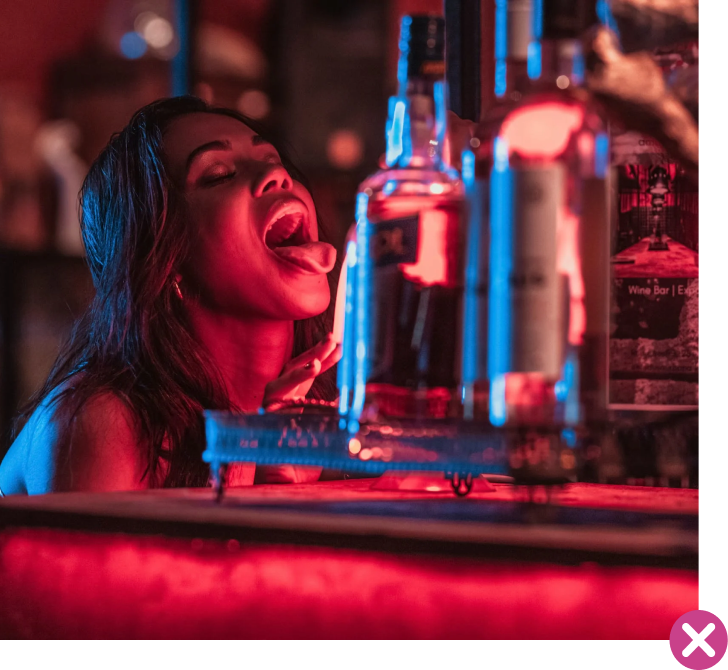
Photography
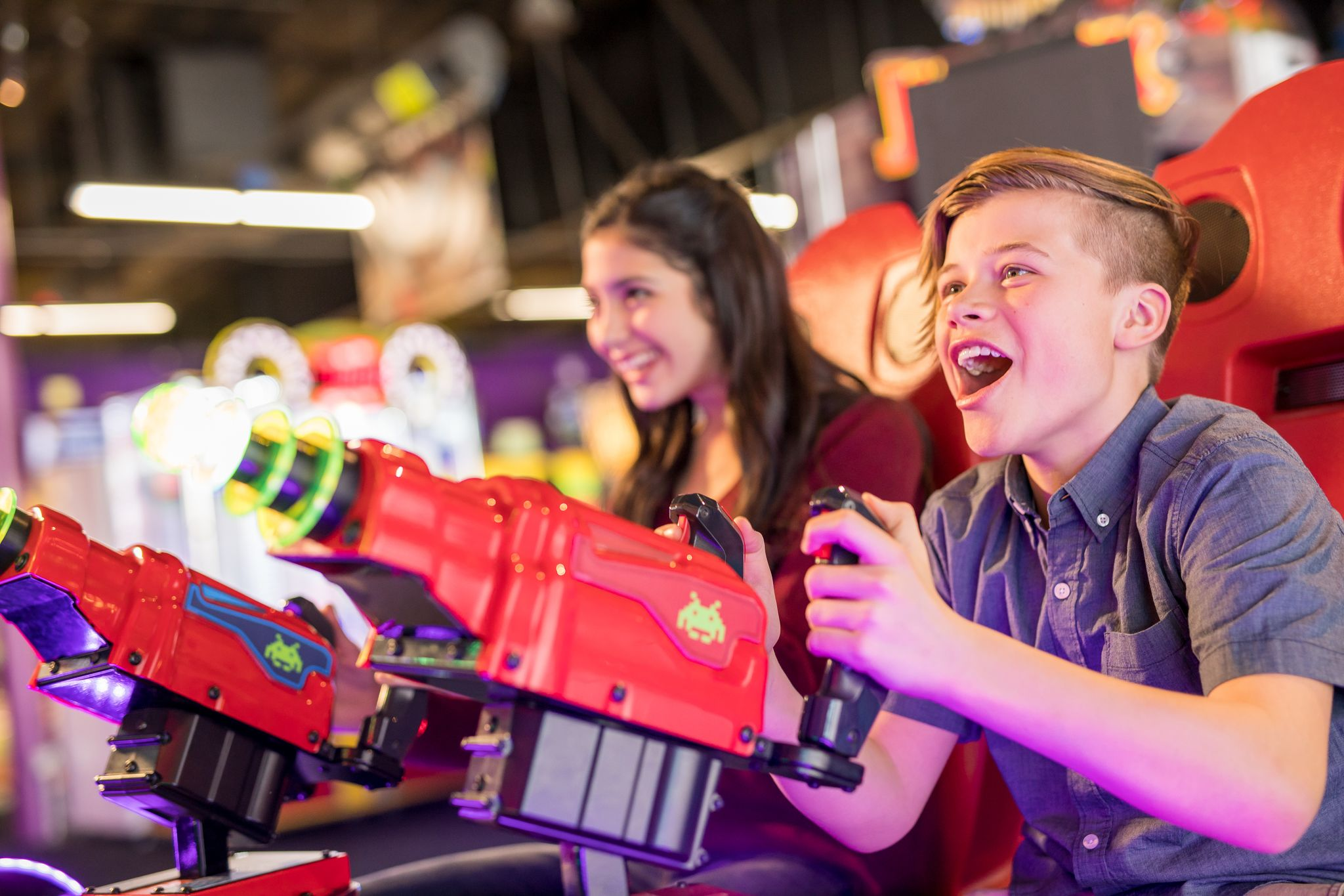
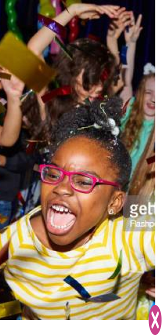
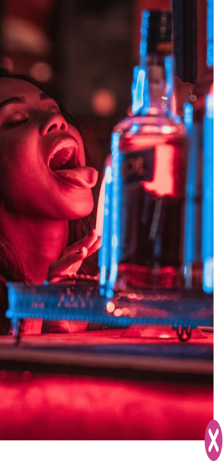
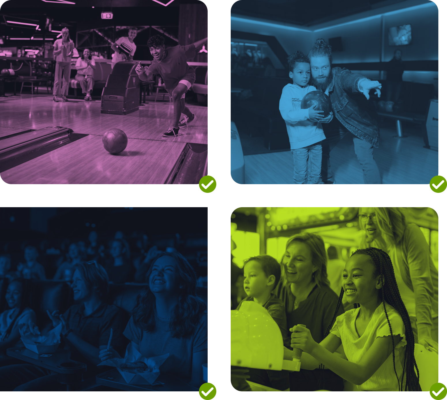
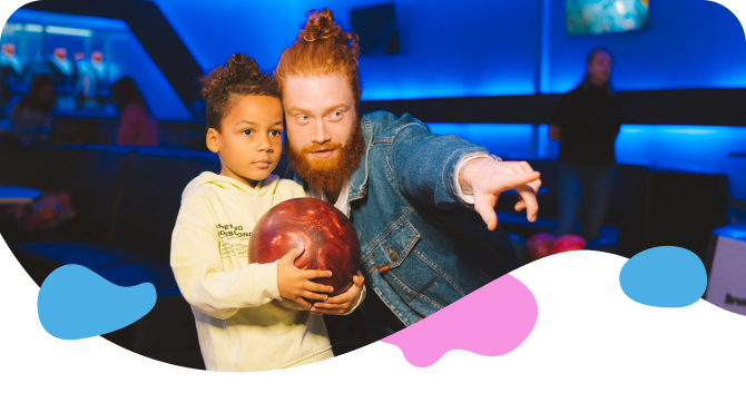
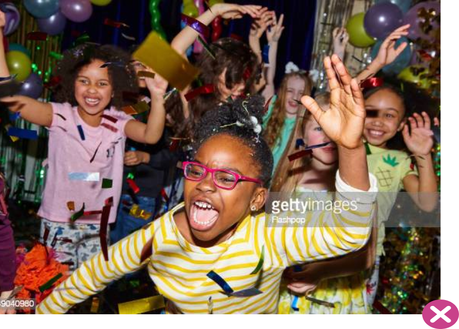
Photography is an important part of the FatCats brand. By showing diverse, relatable people having fun together we communicate our goal of delighting and connecting people. Photos should be fun, genuine, colorful, and uplifting. Whenever possible use custom photography captured in a FatCats facility.
5a
examples
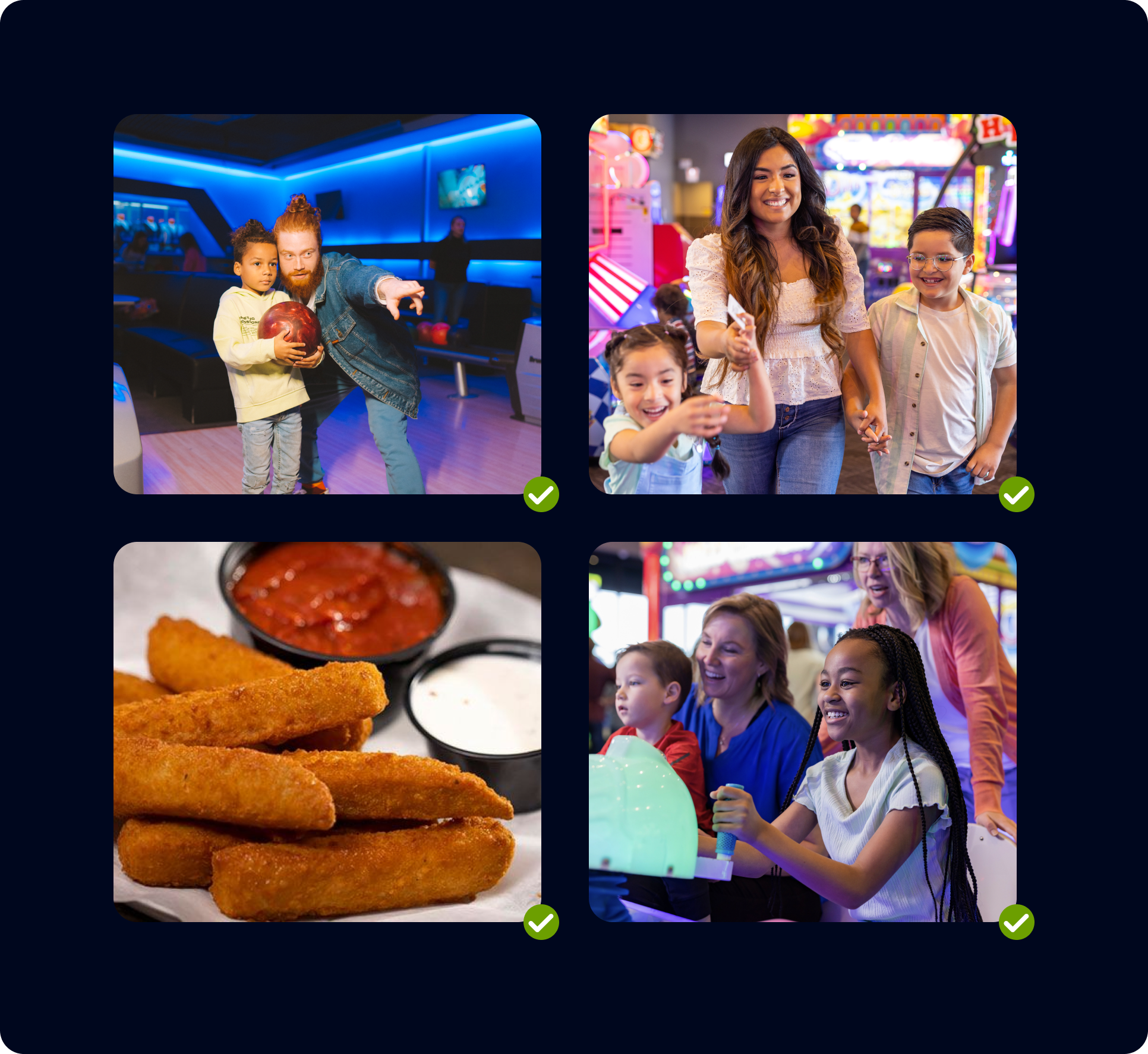
When creating or selecting photography, seek out diversity, joy, warmth, sincerity, community, and playful energy. When showcasing food, places, or objects look for imagery that is clean, appetizing, and focused on a clear subject.

When creating or selecting photography, seek out diversity, joy, warmth, sincerity, community, and playful energy. When showcasing food, places, or objects look for imagery that is clean, appetizing, and focused on a clear subject.
5b
Duotone Colors
Duotone photos are made up of two (duo) contrasting colors (tones). This effect can be achieved using most design tools like Photoshop or Figma. Duotone photos can be used to bring texture and brand colors into design work. We recommend using full color photography when the photo is acting as the subject or hero of a design. Duotone imagery is recommended for use when text or graphics are intended to be the focus and the photo is simply adding a little texture/color.
When applying the duotone effect for FatCats we recommend using a single brand color paired with Night.
04
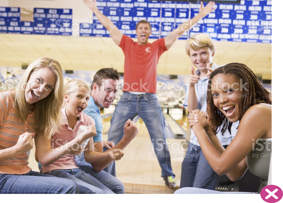
Putting it all together
When applied cohesively, the brand elements create a unified and compelling visual identity. Photography, layout, color, and typography combine to tell the story of Utter Therapeutics—revolutionizing care through thoughtful, human-centered design.
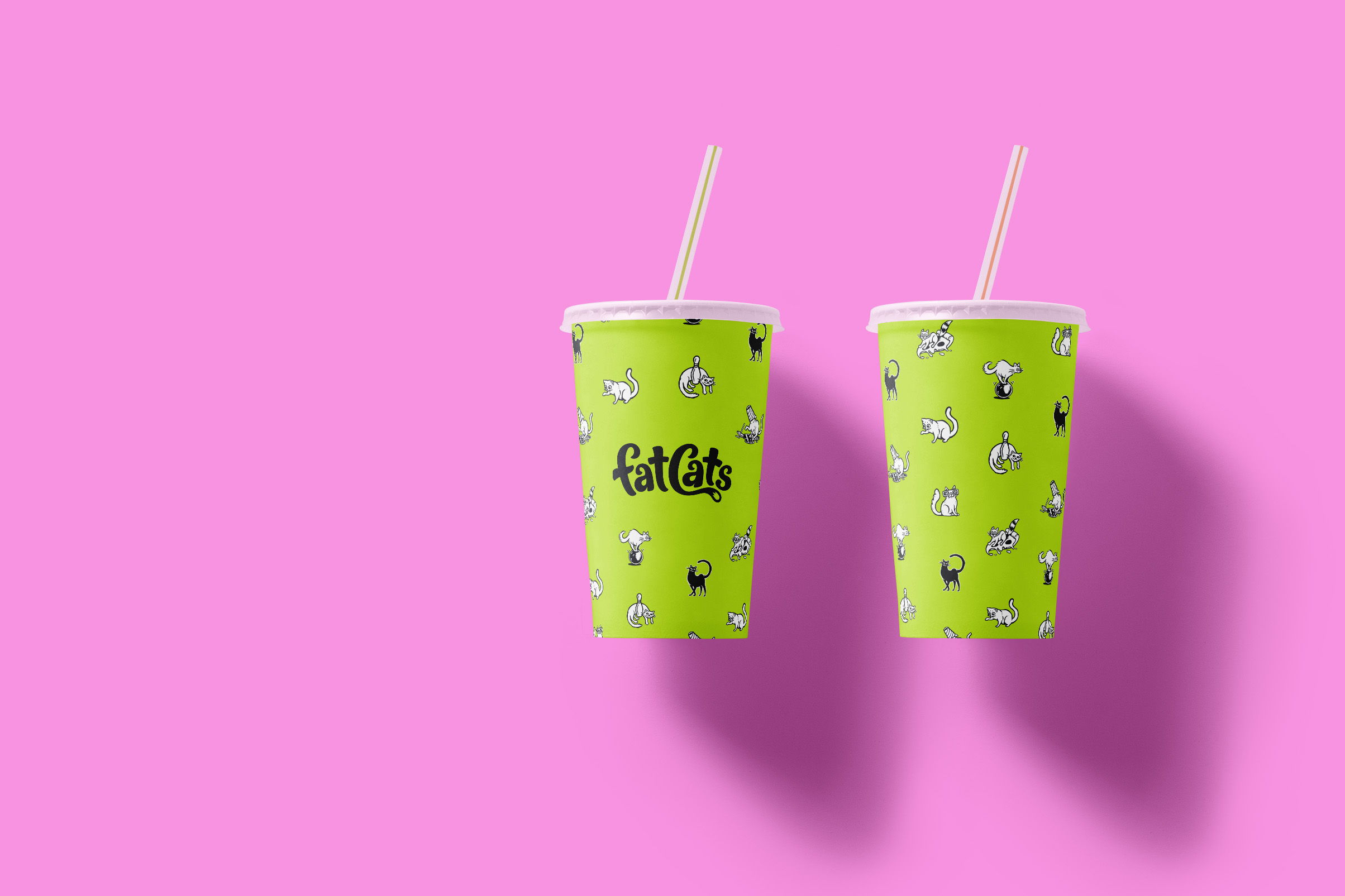

Bowling for Cats
These cat illustrations should typically be used as small supportive elements— something to be discovered like a charming little detail that one might overlook if they weren’t paying attention. Illustration should typically be kept below Photography and Headlines in design hierarchy.


Submit a Creative Request
Back to the top
↑
Made with 💙 in Salt Lake City by Underbelly Creative.

Submit a Creative Request

Brand Guidelines
The FatCats brand is vibrant, bold, and charmingly imperfect. The visual design system thoughtfully combines a punchy palette, strong type, energetic photography, and organic design elements to create a carefully balanced identity optimized for our guests and community.
01
Logo
The FatCats logo has been crafted to possess an energetic, hand-drawn quality, with careful consideration to the spacing, balance, and scalability of the design. The wordmark pays homage to the old FatCats logo with a more clean, bold, and contemporary execution.
1a
Primary Lockup

1b
Clearspace


1c
Layout variations

The primary logo should be the default for branded applications. The logo badge can be used to add visual weight or when reinforcing the connection between the old logo and the new. The monograms should be limited to situations where the viewer already knows the name of the company or they can see it elsewhere in the designed space.
1c
two-color logo

We recommend using a one color logo for most FatCats applications. However, in the interest of adding variety and flexibility to the brand we have created a two color version of the badge. This allows us to incorporate the primary colors (lime, grapefruit, & blueberry) into applications with white backgrounds while maintaining high contrast.
1d
Incorrect Usage

Don’t alter the logo proportions in any way.
Don’t tilt the logo at odd angles.
Don’t use it over unapproved colors.
Don’t place it over busy imagery.
Don’t apply effects or textures to the logo.
1e
Partnerships

02
Color
The colors used for FatCats reflect the brand attributes. They are vibrant, playful, and versatile. The colors were inspired by clean citrus fruits and bright neon signs.
2a
Primary Palette
Lime
#BDE423
RGB 189, 228, 35
CMYK 36, 0, 100, 0
Pantone 375 C

Grapefruit
#F793E0
RGB 247, 147, 224
CMYK 4, 52, 0, 0
Pantone 211 C

Blueberry
#4BAFE5
RGB 75, 175, 229
CMYK 71, 10, 0, 0
Pantone 2191 C

Lemon
#F8DA07
RGB 248, 218, 7
CMYK 3, 11, 100, 0
Pantone 3955 C

Orange
#FA842E
RGB 250, 132, 46
CMYK 0, 64, 100, 0
Pantone 151 C

Blackberry
RGB 0, 54, 104
CMYK 100, 83, 32, 21
Pantone 3591 C

Watermelon
#025500
RGB 2, 85, 0
CMYK 89, 38, 100, 38
Pantone 349 C

2b
Secondary Palette
White
#FFFFFF
RGB 255, 255, 255
CMYK 0, 0, 0, 0
Gray 01
#F8F9FD
RGB 248, 249, 253
CMYK 2, 1, 0, 0
Pantone Cool Gray 1 C
Gray 02
#EBEDF3
RGB 235, 237, 243
CMYK 6, 4, 1, 0
Pantone 427 C
Gray 03
#CED0D8
RGB 206, 208, 216
CMYK 18, 13, 9, 0
Pantone 428 C
Gray 04
#878B99
RGB 135, 139, 153
CMYK 51, 41, 30, 2
Pantone 429 C
Gray 05
#393E50
RGB 57, 62, 80
CMYK 80, 71, 46, 37
Pantone 431 C
Gray 06 / Night
#10131C
RGB 16, 19, 28
CMYK 81, 73, 59, 77
Pantone Black 6 C
03
Typography
The typefaces for FatCats are Sans Plomb and Avenir Next.
Sans Plomb is a grotesque family inspired by the automotive world of the 80’s: from gas station signs to spare part brands, the font takes us back a few decades, when typefaces were somehow imperfect — and beautiful for that. It’s the perfect family for huge display titles.
Avenir Next is a new take on a classic font—it’s the result of a project whose goal was to take a beautifully designed sans and update it so that its technical standards surpass the status quo, leaving us with a truly superior sans family.
SANSPLOMB 98 WT
Avenir Next (Regular)
The Google font ANTON is an approved substitute for situations where SansPlomb is not available.
The Google font Inter is an approved substitute for situations where Avenir Next is not available.
3a
Typescale
107px
7 rem
Hero
69px
4 rem
Header 2
86px
5 rem
Header 1
44px
3 rem
Header 3
28px
2 rem
Header 4
22px
1.33 rem
Header 5
Headers
18px
1 rem
Body text should be Avenir Next 18pt* font. This is what bold text looks* like in a paragraph, static text link, tempor incididunt ut labore et hover link aliqua. Ut nostrud clicked link minim veniam.
14px
0.8 rem
Meta / Small Text
Body
The FatCats type scale is different size of type that may be used for anything and everything associated with the brand. Use these guidelines for sizing and spacing of type. The type is built on a 18px type base (or 1 rem). The line-height (space between lines of text) is 1x (or 100%) for Sans Plomb headers and 1.75x (or 175%) for body and meta text.
The line-height (space between lines of text) is 1x (or 100%) for Sans Plomb headers and 1.75x (or 175%) for body and meta text.
The line-height (space between lines of text) is 1x (or 100%) for Sans Plomb headers and 1.75x (or 175%) for body and meta text.
3b
rhythm
Hero
0.4
0.4
0.4
H1
0.4
0.4
H2
0.4
0.4
H3
0.4
0.4
H4
0.4
0.4
H5
0.4
1.75
Body / Paragraph
1.75
1.75
Meta / Small Text
1.75
Rhythm is a visual tempo or beat and is also called movement. It is often achieved through the careful placement of repeated components which invite the viewer's eye to jump rapidly or jump smoothly from one point to another. It refers to the spacing around different blocks of text.
The closeness between lines of text helps it feel friendlier and playful. It will help readers follow smoothly and easily and if you use this everywhere you have type, it will all stay on brand.
The type rhythm uses 0.4x (or 40%) for the header type sizes and 1.75x (or 175%) for body / paragraph and small text.
04
Flowing Forms
FatCats uses a collection of organic flowing forms as decorative supporting elements in designs. These should be rendered in a consistent style that has playful energy without appearing chaotic or accidental. Flowing forms can be used to reinforce the brand while bringing color, movement, and personality into designs.
Flowing Forms are limited to 3 colors max (2 colors when used to mask a photo). This helps to keep designs from appearing messy or unintentional.


4a
Typescale
Though they may appear to be random, all of the shapes used in the Flowing Forms design element are derived from the FatCats logo. Some shapes outline a single character, some trace multiple letters, while others draw from a section of a letter.
A library of core shapes is available to be used as building blocks for creating new layouts. There is also a collection of pre-designed layouts available for use.
4b
Floating layouts

We created a collection of free floating layouts that can be used in a broad variety of applications. These layouts look good when they spill off the edge of a page on one side with ample negative space above and below. Any elements placed over a floating layout should have high contrast against the colors and/or image.
05
Photography
Photography is an important part of the FatCats brand. By showing diverse, relatable people having fun together we communicate our goal of delighting and connecting people. Photos should be fun, genuine, colorful, and uplifting. Whenever possible use custom photography captured in a FatCats facility.
5a
examples

When creating or selecting photography, seek out diversity, joy, warmth, sincerity, community, and playful energy. When showcasing food, places, or objects look for imagery that is clean, appetizing, and focused on a clear subject.


When creating or selecting photography, seek out diversity, joy, warmth, sincerity, community, and playful energy. When showcasing food, places, or objects look for imagery that is clean, appetizing, and focused on a clear subject.
5b
Duotone Colors
Duotone photos are made up of two (duo) contrasting colors (tones). This effect can be achieved using most design tools like Photoshop or Figma. Duotone photos can be used to bring texture and brand colors into design work. We recommend using full color photography when the photo is acting as the subject or hero of a design. Duotone imagery is recommended for use when text or graphics are intended to be the focus and the photo is simply adding a little texture/color.
When applying the duotone effect for FatCats we recommend using a single brand color paired with Night.
04
Putting it all together
When applied cohesively, the brand elements create a unified and compelling visual identity. Photography, layout, color, and typography combine to tell the story of Utter Therapeutics—revolutionizing care through thoughtful, human-centered design.


Bowling for Cats
These cat illustrations should typically be used as small supportive elements— something to be discovered like a charming little detail that one might overlook if they weren’t paying attention. Illustration should typically be kept below Photography and Headlines in design hierarchy.

Submit a Creative Request
Made with 💙 in Salt Lake City by Underbelly Creative.
Back to the top
↑

Putting it all together
04
Submit a Creative Request

Brand Guidelines
The FatCats brand is vibrant, bold, and charmingly imperfect. The visual design system thoughtfully combines a punchy palette, strong type, energetic photography, and organic design elements to create a carefully balanced identity optimized for our guests and community.
01
Logo
The FatCats logo has been crafted to possess an energetic, hand-drawn quality, with careful consideration to the spacing, balance, and scalability of the design. The wordmark pays homage to the old FatCats logo with a more clean, bold, and contemporary execution.
1a
Primary Lockup

1b
Clearspace

1c
Layout variations

The primary logo should be the default for branded applications. The logo badge can be used to add visual weight or when reinforcing the connection between the old logo and the new. The monograms should be limited to situations where the viewer already knows the name of the company or they can see it elsewhere in the designed space.
1c
two-color logo

We recommend using a one color logo for most FatCats applications. However, in the interest of adding variety and flexibility to the brand we have created a two color version of the badge. This allows us to incorporate the primary colors (lime, grapefruit, & blueberry) into applications with white backgrounds while maintaining high contrast.
1d
Incorrect Usage


Don’t alter the logo proportions in any way.
Don’t tilt the logo at odd angles.
Don’t use it over unapproved colors.
Don’t place it over busy imagery.
Don’t apply effects or textures to the logo.
1e
Partnerships

02
Color
The colors used for FatCats reflect the brand attributes. They are vibrant, playful, and versatile. The colors were inspired by clean citrus fruits and bright neon signs.
2a
Primary Palette
Lime
#BDE423
RGB 189, 228, 35
CMYK 36, 0, 100, 0
Pantone 375 C

Grapefruit
#F793E0
RGB 247, 147, 224
CMYK 4, 52, 0, 0
Pantone 211 C

Blueberry
#4BAFE5
RGB 75, 175, 229
CMYK 71, 10, 0, 0
Pantone 2191 C

Lemon
#F8DA07
RGB 248, 218, 7
CMYK 3, 11, 100, 0
Pantone 3955 C

Orange
#FA842E
RGB 250, 132, 46
CMYK 0, 64, 100, 0
Pantone 151 C

Blackberry
RGB 0, 54, 104
CMYK 100, 83, 32, 21
Pantone 3591 C

Watermelon
#025500
RGB 2, 85, 0
CMYK 89, 38, 100, 38
Pantone 349 C

2b
Secondary Palette
White
#FFFFFF
RGB 255, 255, 255
CMYK 0, 0, 0, 0
Gray 01
#F8F9FD
RGB 248, 249, 253
CMYK 2, 1, 0, 0
Pantone Cool Gray 1 C
Gray 02
#EBEDF3
RGB 235, 237, 243
CMYK 6, 4, 1, 0
Pantone 427 C
Gray 03
#CED0D8
RGB 206, 208, 216
CMYK 18, 13, 9, 0
Pantone 428 C
Gray 04
#878B99
RGB 135, 139, 153
CMYK 51, 41, 30, 2
Pantone 429 C
Gray 05
#393E50
RGB 57, 62, 80
CMYK 80, 71, 46, 37
Pantone 431 C
Gray 06 / Night
#10131C
RGB 16, 19, 28
CMYK 81, 73, 59, 77
Pantone Black 6 C
03
Typography
The typefaces for FatCats are Sans Plomb and Avenir Next.
Sans Plomb is a grotesque family inspired by the automotive world of the 80’s: from gas station signs to spare part brands, the font takes us back a few decades, when typefaces were somehow imperfect — and beautiful for that. It’s the perfect family for huge display titles.
Avenir Next is a new take on a classic font—it’s the result of a project whose goal was to take a beautifully designed sans and update it so that its technical standards surpass the status quo, leaving us with a truly superior sans family.
SANSPLOMB 98 WT
Avenir Next (Regular)
The Google font ANTON is an approved substitute for situations where SansPlomb is not available.
The Google font Inter is an approved substitute for situations where Avenir Next is not available.
3a
Type scale
107px
7 rem
Hero
69px
4 rem
Header 2
86px
5 rem
Header 1
44px
3 rem
Header 3
28px
2 rem
Header 4
22px
1.33 rem
Header 5
Headers
18px
1 rem
Body text should be Avenir Next 18pt* font. This is what bold text looks* like in a paragraph, static text link, tempor incididunt ut labore et hover link aliqua. Ut nostrud clicked link minim veniam.
14px
0.8 rem
Meta / Small Text
Body
The FatCats type scale is different size of type that may be used for anything and everything associated with the brand. Use these guidelines for sizing and spacing of type. The type is built on a 18px type base (or 1 rem). The line-height (space between lines of text) is 1x (or 100%) for Sans Plomb headers and 1.75x (or 175%) for body and meta text.
The line-height (space between lines of text) is 1x (or 100%) for Sans Plomb headers and 1.75x (or 175%) for body and meta text.
The line-height (space between lines of text) is 1x (or 100%) for Sans Plomb headers and 1.75x (or 175%) for body and meta text.
3b
rhythm
Hero
0.4
0.4
0.4
H1
0.4
0.4
H2
0.4
0.4
H3
0.4
0.4
H4
0.4
0.4
H5
0.4
1.75
Body / Paragraph
1.75
1.75
Meta / Small Text
1.75
Rhythm is a visual tempo or beat and is also called movement. It is often achieved through the careful placement of repeated components which invite the viewer's eye to jump rapidly or jump smoothly from one point to another. It refers to the spacing around different blocks of text.
The closeness between lines of text helps it feel friendlier and playful. It will help readers follow smoothly and easily and if you use this everywhere you have type, it will all stay on brand.
The type rhythm uses 0.4x (or 40%) for the header type sizes and 1.75x (or 175%) for body / paragraph and small text.
04
Flowing Forms
FatCats uses a collection of organic flowing forms as decorative supporting elements in designs. These should be rendered in a consistent style that has playful energy without appearing chaotic or accidental. Flowing forms can be used to reinforce the brand while bringing color, movement, and personality into designs.
Flowing Forms are limited to 3 colors max (2 colors when used to mask a photo). This helps to keep designs from appearing messy or unintentional.


4a
Diverse but not random
Though they may appear to be random, all of the shapes used in the Flowing Forms design element are derived from the FatCats logo. Some shapes outline a single character, some trace multiple letters, while others draw from a section of a letter.
A library of core shapes is available to be used as building blocks for creating new layouts. There is also a collection of pre-designed layouts available for use.
4b
Floating layouts

We created a collection of free floating layouts that can be used in a broad variety of applications. These layouts look good when they spill off the edge of a page on one side with ample negative space above and below. Any elements placed over a floating layout should have high contrast against the colors and/or image.
05
Photography
Photography is an important part of the FatCats brand. By showing diverse, relatable people having fun together we communicate our goal of delighting and connecting people. Photos should be fun, genuine, colorful, and uplifting. Whenever possible use custom photography captured in a FatCats facility.
5a
examples
When creating or selecting photography, seek out diversity, joy, warmth, sincerity, community, and playful energy. When showcasing food, places, or objects look for imagery that is clean, appetizing, and focused on a clear subject.
When creating or selecting photography, seek out diversity, joy, warmth, sincerity, community, and playful energy. When showcasing food, places, or objects look for imagery that is clean, appetizing, and focused on a clear subject.
5b
Duotone Colors
Duotone photos are made up of two (duo) contrasting colors (tones). This effect can be achieved using most design tools like Photoshop or Figma. Duotone photos can be used to bring texture and brand colors into design work. We recommend using full color photography when the photo is acting as the subject or hero of a design. Duotone imagery is recommended for use when text or graphics are intended to be the focus and the photo is simply adding a little texture/color.
When applying the duotone effect for FatCats we recommend using a single brand color paired with Night.
04
Putting it all together
When applied cohesively, the brand elements create a unified and compelling visual identity. Photography, layout, color, and typography combine to tell the story of Utter Therapeutics—revolutionizing care through thoughtful, human-centered design.


Bowling for Cats
These cat illustrations should typically be used as small supportive elements— something to be discovered like a charming little detail that one might overlook if they weren’t paying attention. Illustration should typically be kept below Photography and Headlines in design hierarchy.

Submit a Creative Request
Made with 💙 in Salt Lake City by Underbelly Creative.
Back to the top
↑